Hello there and Happy New Year!
I hope everyone’s staying warm with this crazy winter weather. Here’s what’s happened since the last newsletter:
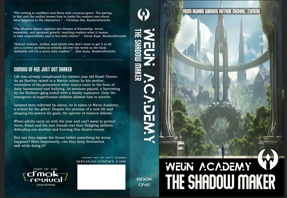
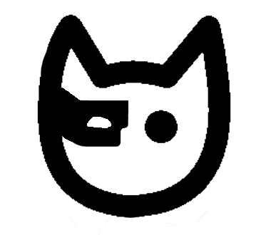
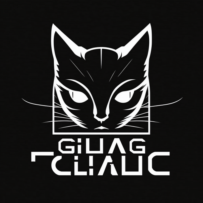
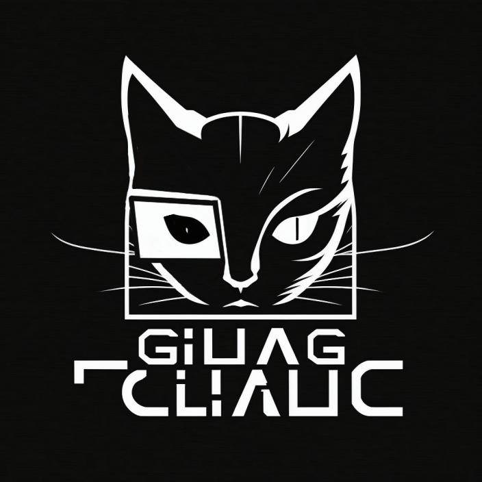
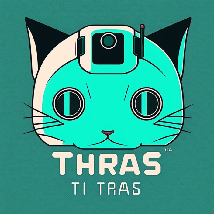
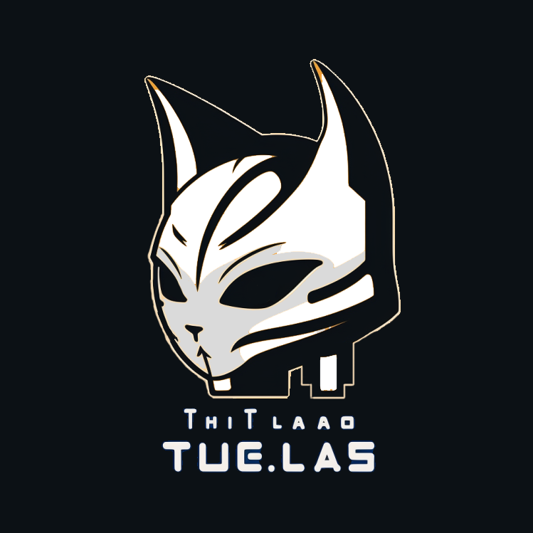
TORIKO TALES IS OUT!
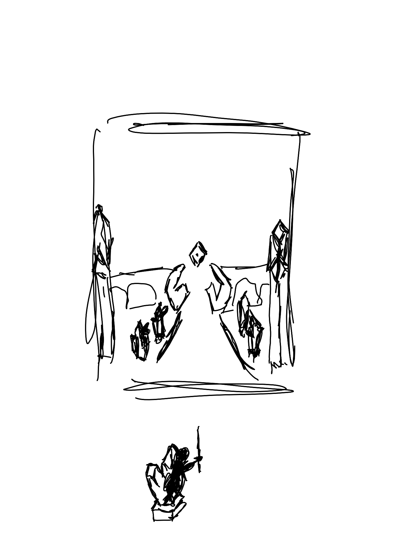
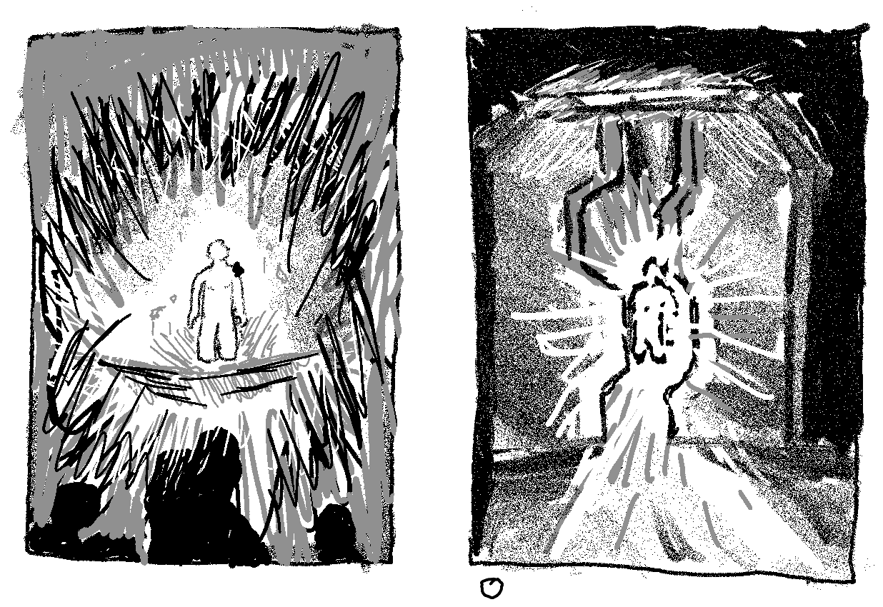
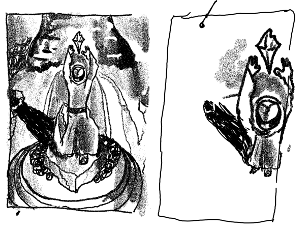
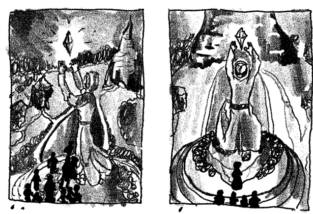
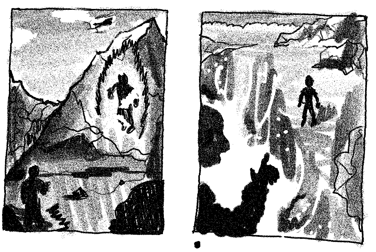
Toriko Tales: Toriko vs The Crowned Paw officially released on December 30, 2025, and is now available on Amazon!
As a thank-you for being a subscriber, I’ve included an extended preview of the first five chapters. (An earlier preview included only two.)
As I mentioned last time, this book is very tonally different from Weun Academy. It dives into themes of artificial intelligence, ethics (or the lack of them), betrayal, deception, and some very dark family secrets—along with plenty of cat puns and twists along the way!
Learn more here: http://www.torikotales.com.
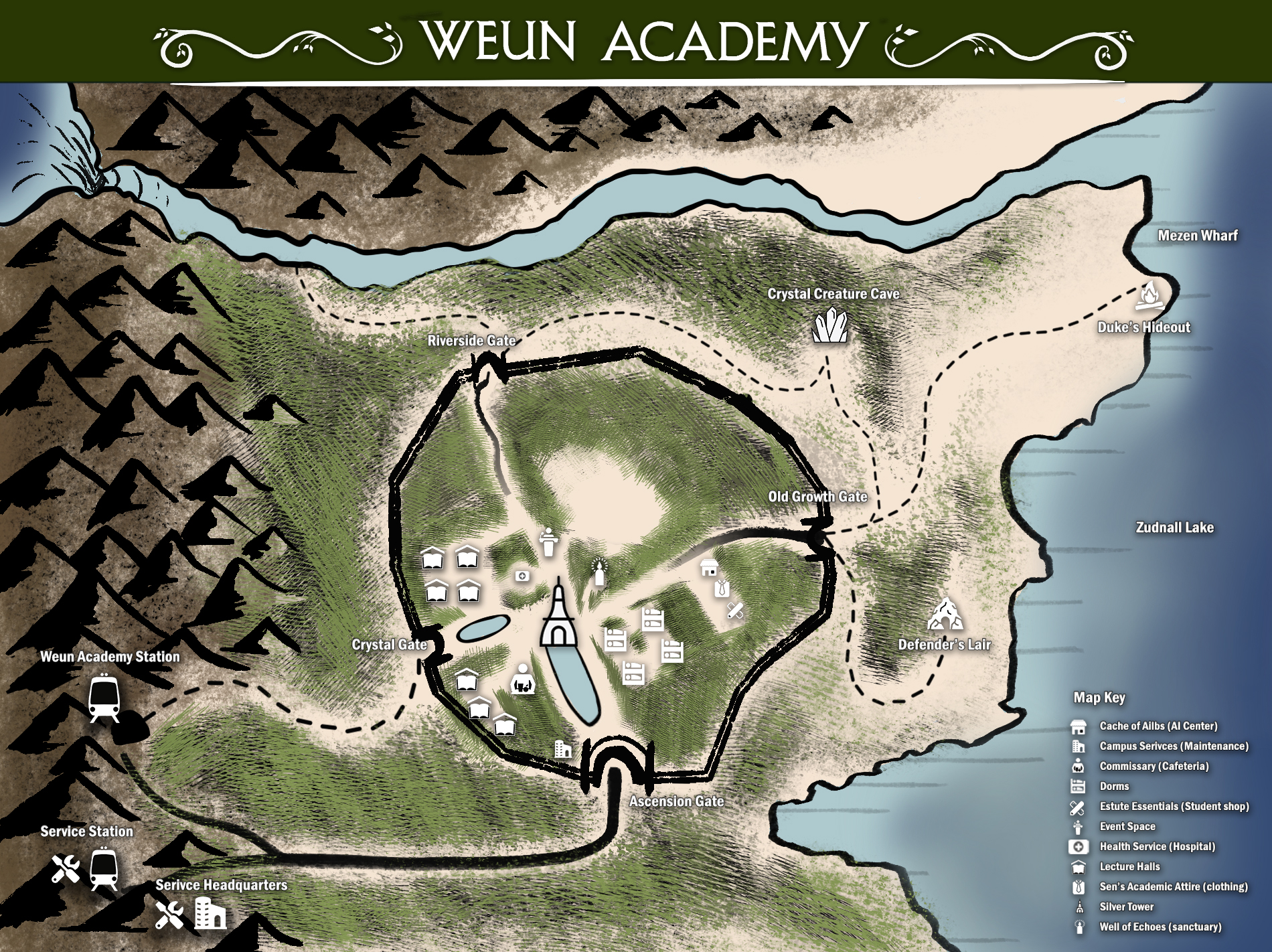
WEUN ACADEMY PRONOUNCATION GUIDE
Everyone reads names differently—and I love that. But a few readers have asked how I originally intended them to sound.
So I finally did it: Weun Academy Pronunciation Guide is now live!
It’s a permanent addition to the D’mok Revival site, and I’ll likely create one for each book going forward. Let me know what you think!
NEBULA AWARD
I’m officially a full member of the Science Fiction Writer’s Association (SFWA)—which has been an amazing and very supportive community. For those that are unfamiliar, SFWA is also the home of the renowned Nebula Awards.
Both Weun Academy and Toriko Tales are now on the reading list and eligible for consideration for the 2026 Nebula Award!
No matter what happens, it’s incredibly exciting to even be in the conversation. I’ll keep you posted!
LATEST ENDEAVORS
Most of my time lately has gone into post-release work for Toriko Tales, but Matt and I have also been experimenting with something fun…
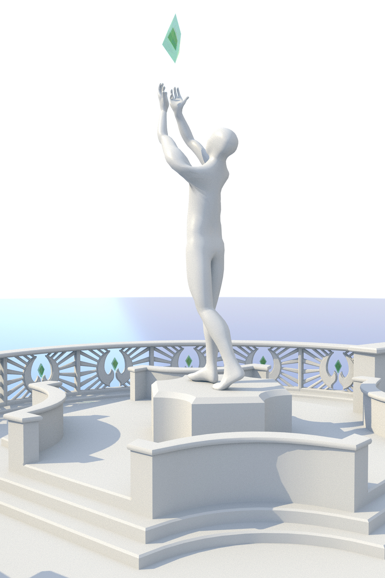
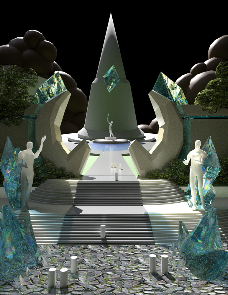
We’ve been playing around with a HoverDome: Red Canyon Run video game concept!
Quick background: HoverDome is the hoverbike racing arena featured in D’mok Revival and Weun Academy. We successfully kickstarted the board game edition a few years ago. This is just a creative side project for now—but it’s been a blast to explore.
Next up after a short break: Continued work on the next Weun Academy story.
I’D LOVE TO HEAR FROM YOU!
I genuinely love hearing your thoughts—the good and the constructive. It’s how I grow as a story teller and learn how to connect better with you.
If you’ve read D’mok Revival, Weun Academy, or Toriko Tales, I’d love to know:
- “Who your favorite characters are”
- “What you want to see more of”
- “What surprised you”
- “Or what didn’t land for you”
And/or if you’re reading something else great, tell me about it!
You can always email me or DM me on Facebook.
THANKS AGAIN
Your support truly means the world to me! Stay warm, and talk to you soon!
— Mike Zummo
P.S. If you know someone who’d enjoy these stories, feel free to forward this along. I truly appreciate it!