The cover is the first place you can capture a reader’s imagination and make them want to see more about “that.” You have mere seconds as people scan across thumbnails online, or across a book shelf to snag their attention. People ALWAYS judge a book by its cover first. In fact, the brain is optimized to discern appealing things in an instant.
Getting the contents of a book is very important. However, if the cover isn’t epic, if it doesn’t snag people’s attention, getting people to read your content will be a far more difficult task.
I thought I’d go through and talk about the process used for the second cover.
- Build on knowledge of the genre, researched the first time around
- Leverage what I’ve learned from book 1’s cover
- Build the series identity
- Tapping action of book 2
- Initial concepts
- Focus group testing and iteration
BUILD ON KNOWLEDGE
When I first entered the science fiction space (pun intended), I researched the major series. I was interested in aligning my visuals and branding with space operas and household science fiction names. Specifics included: Star Wars, Star Trek, Firefly, Babylon 5, Dune, Battlestar Galactica, Stargate, and so on.
I analyzed logo design and placement, common elements on covers, where they put series versus book names, how they designed their book spine, how much information they put on the cover, etc.
There were clear patterns. A bold series logo was at the top, with book name directly under it, or on the bottom of the cover. Stories with well known characters used illustrations against a space backdrop. Others focused on the technology showing ships or space stations. More imaginative ones also tried to illustrate a specific moment in the book. Back covers were sparce, with some text, little visuals. Spines typically displayed a tiny visual, mostly logos and book names.
As a side note, I also reviewed fantasy covers. Those are typically beautiful and very visually engaging. Even the spines have amazing artwork.
LEVERAGE
The first cover had a show-stopper scene with an intense background, ominous space station, ship heading towards it. People were instantly drawn to it. Hundreds of people at ComicCon Chicago didn’t know anything about my series, but they saw the visual and came over to find out. This showed me how important the main visual was to get right! The other aspect I learned was to keep cover elements simple and focused. Don’t over clutter the main visual. Allow a few, larger elements to strike hard and pull them in. Most of all, drive their curiosity. Make them want to “visit” that place (by reading your story).
After launch, I was frequently told how understated my series name was on the first cover. Also, while the book title at the bottom was well sized, it wasn’t chaining with the series name as I had hoped. Another weakness was the lack of review quotes and other things to legitimize the work, or give people context for how others interpret the story.
I have a number of awards I could put on the cover: Amazon top 20 best seller in Alien Invasion, and 5-star winner by Readers’ Choice. But those came after the launch. Admittedly this is a tough one for me, as professional reviewers still won’t touch the series.
Nevertheless, you may have professional reviewers. If you do, try to fit in a few key words or phrases from their review on your cover. Just look at the top 40 book shelf to see how the pros position quotes.
BUILDING SERIES
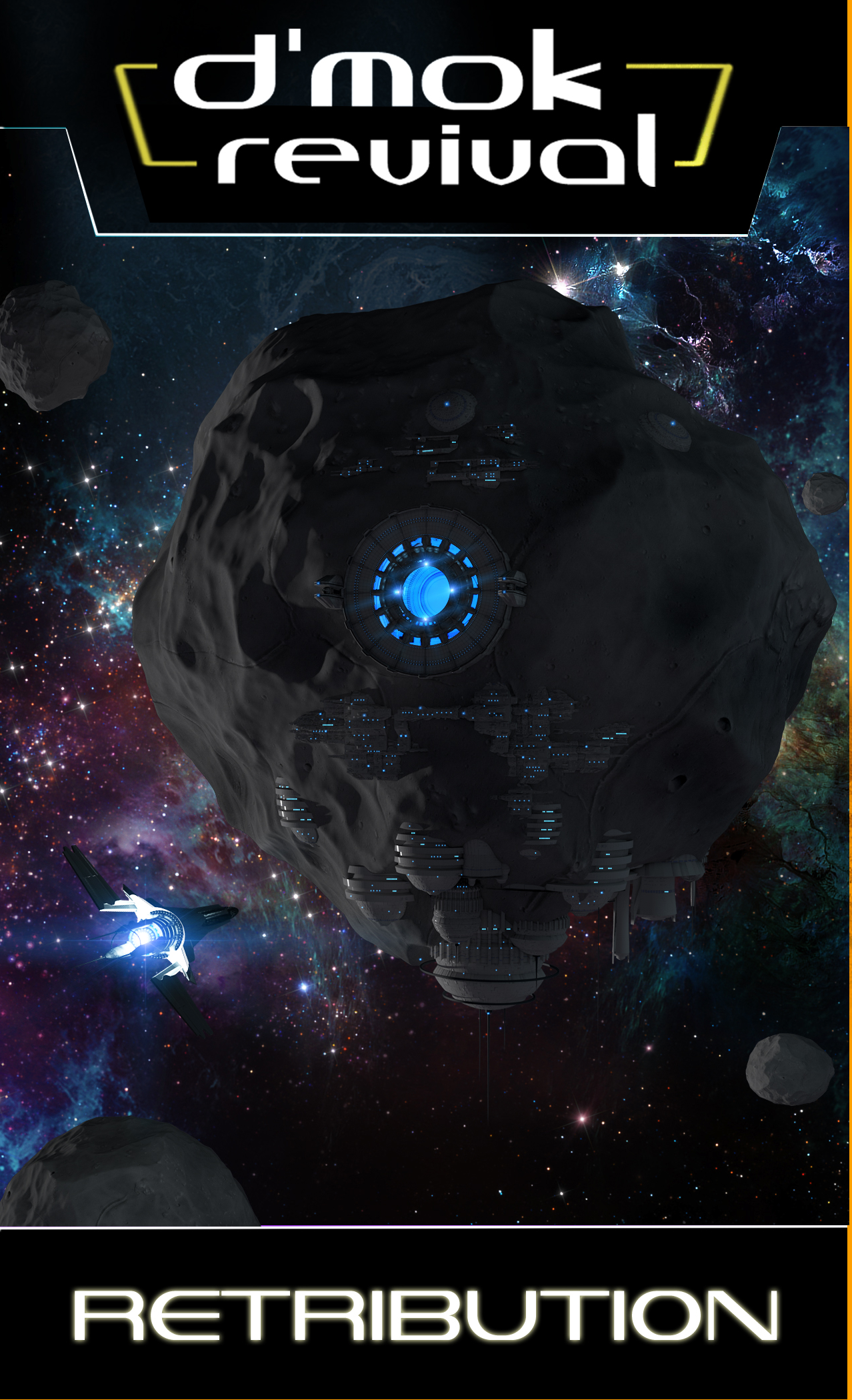
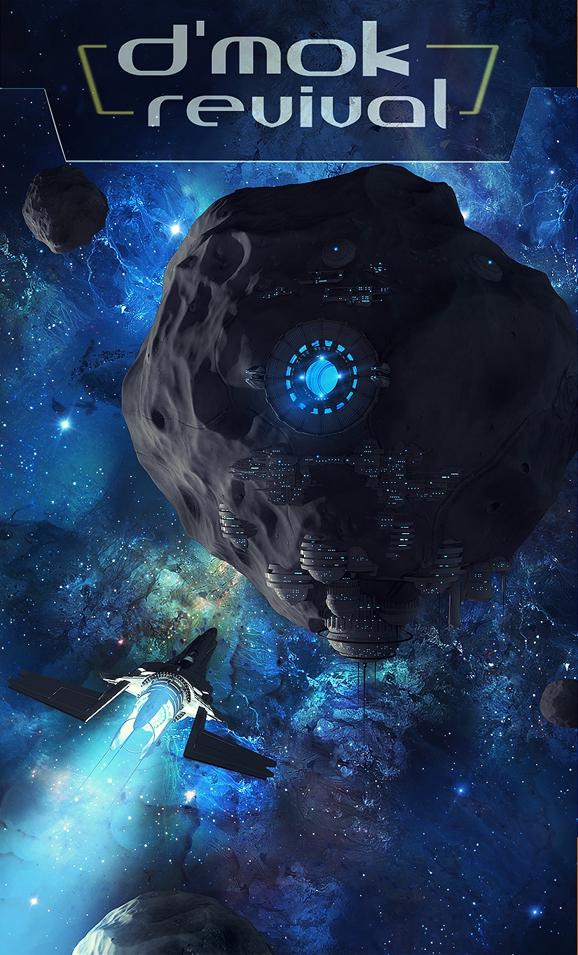
I’m working on creating a particular look for the series. A cool background, a major location, and a main ship is the approach I’m going to use for covers of the first trilogy. I’m also going to use a color scheme approach. The first book’s nebula was red, this one will be blue. Depending on the feel of the third book it may be more violet.
I want to create a consistency with the visual appearance. This means the logo will be at the top, there will be a black barred off area on the bottom for the book title. The spine will have the “wrap-around” space scene at the top and bottom, with the logo and book title in the middle. The back will have a barred off top and bottom showing the “wrap-around” space scene with Nukari and D’mar logos in the corner. The descriptive text will be on black. It creates a specific, streamlined look that I really like.
I have, as of the second book, updated the logo based on the feedback I received. It’s cleaner and larger. I’m going back and modifying the first book to support this update to the branding.
TAPPING ACTION
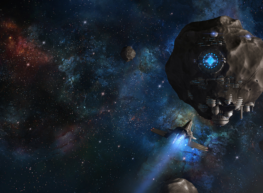
As I mentioned before I want to visually engage readers, and pique their interest. The first book shows the Trading Post, a major location throughout the series. The second will focus on Osuto’s asteroid base. As another major location for the series, I wanted to show people what it looks like in addition to wanting them to “go inside” and experience what it’s like to be there.
For now, the same ship from the first cover is being shown again. It was assumed to be either Osuto’s ship or the one recovered from the graveyard of ships in the first book. Technically, it could also be Ujaku’s ship. Which ship it is has not been finally decided yet. Strange right? Let’s just say, for now, I’ve left it up to the reader to determine which it is. I’m guessing most people assume it’s Osuto’s ship.
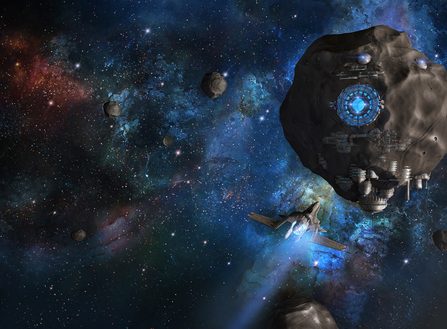
Glenn did an amazing design that shows more of the asteroids around it, and a sweeping nebula.
INITIAL CONCEPT
When Glenn and I started working on the second cover, the first thing I did was a crude wireframe design showing the desired blocking for visual elements.

See how crude this was? I only wanted to get the idea across to Glenn. He’s the one that works the magic. I also sent along images of similar concepts of asteroid bases from Google images. Surprisingly, there were few examples of asteroid bases, much less ones that aligned with what I wanted. Many had an element or two, but nothing like what I wanted.
As a side note, it’s important when designing a cover to leverage the visual “Z” scan westerners do with their eyes when reading. They start in the upper-left, move right to the far edge, diagonally down left to the lower left corner, the right again to the lower-right corner. These are basic usability concepts that I leverage in software and Web site design all the time. This is also the pattern used in the first book, and it performed well.
For the second cover, I placed the asteroid base in the same position as the space station, and the ship in the same location.
Glenn went ahead and did an initial version of the asteroid base.
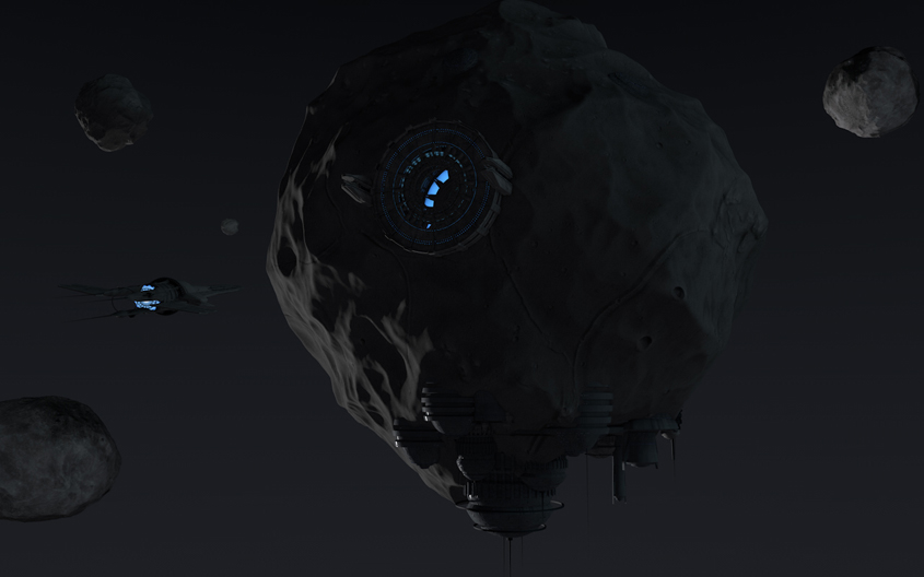
AMAZING START! I had some feedback about additional build-out for the station, and creating more of a connection between the massive space dock and the lower base segment. Then he added in the nebula and some effects.
The nebula was very cool, but didn’t have the radiant blue aspects I had in my head. The base and ship was also cast into shadow, and lost the great detail there. I know printed images tend to go darker than they appear digitally, so I was concerned the image would literally get lost when it went to the press.
This version really made things pop. But the eye was really drawn directly down the left side of the image. In fact, the eye rested on the ship, and the viewer actually missed the station buildings at the bottom of the asteroid. Lighting is so important! I thought adding some building lights would also bring the lower section of the station to life too.
The lights were a cool addition. The ship was angled to look like it was headed to the dock. To me the ship got lost because in all the amazing detail of the nebula. Among the changes I suggested included changing the source of the light so it illuminated more of the right size of the asteroid.
The difference was striking! Glenn enhanced the lighting to bring some features out, and boom, done!
FOCUS GROUP
Each stage of design I tapped my “review team” as I call them. This is a combination of my email group of fans and friends, and then the D’mok Revival Facebook page. Getting my readership’s reactions is very important to me! I was able to quickly get a read on how design performed, identify what people thought was weak about it, etc. Patterns in responses were clear. Those that care about your series also love contributing, so ask them!
Side note: don’t forget to thank those amazing people in your book too!
You can’t be afraid to iterate. You can’t be afraid to talk to your audience. Remember, you get one shot at releasing a book. Make sure when it hits, it hits the mark. Reviewers and readers will not be kind when you launch a product, so help yourself now and get feedback before there’s a train wreck.
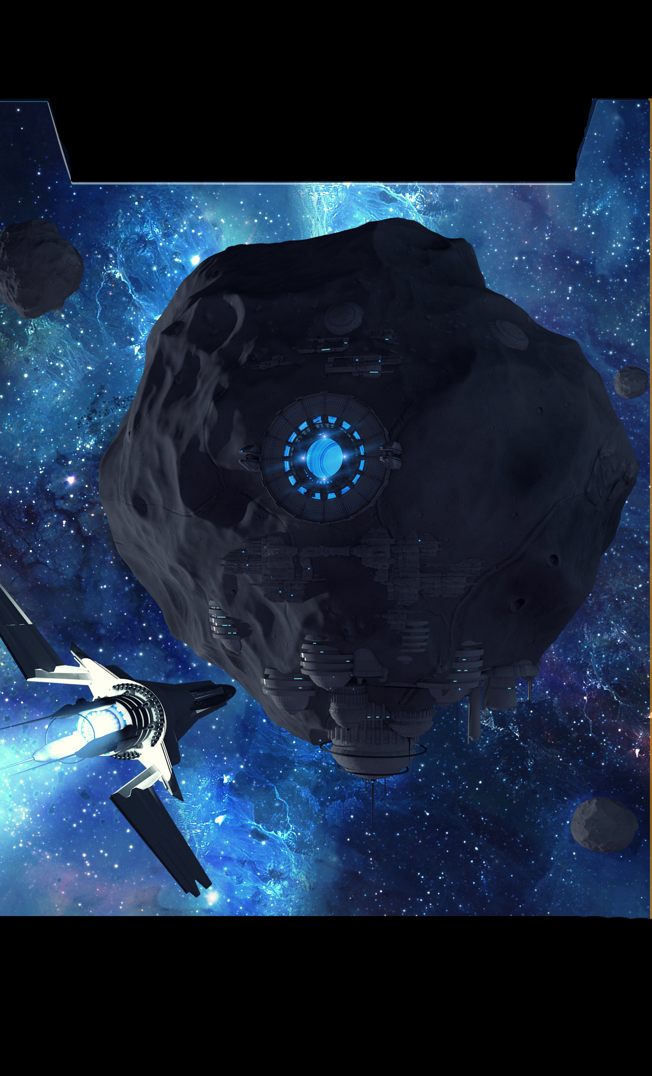
In addition to amazing fans, I have a number of friends who are both science fiction fans, and fans of honesty. They let me know exactly when something didn’t resonate with them. At one of our board game nights I showed them the latest cover. They suggested, while the nebula was cool, to really zoom in on the asteroid base. The concept was to make it more intense, spotlight the amazing visuals. I thought the idea was great. I made a number of zoomed in versions and took to Facebook. The community instantly responded and sent me their thoughts. Again, clear patterns emerged.
The cover you see today is a result of vision, amazing artistry, and key feedback from the D’mok community.
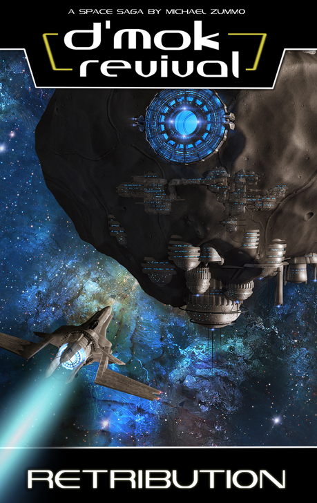
Okay, you may notice the contrail is more pronounced. The truth is I LOVED the contrail from the first book. I actually lifted it from the Photoshop file and superimposed it on this one. I also added a little shadowing effect to both highlight it and create more of a wake disturbance behind the spaceship. It also draws the eye to the left corner, supporting the “Z” visual scan for the viewer’s eyes.
FUTURE
Right now I’m beginning the process on book 3. Taking my own advice above, I’ve started early sketches. Even though the launch party for book 2 is July 19th (next month), I promised to get book 3 out by the holiday season. I need to keep the momentum going and move on it. Once book 2 is out, I’ll start getting cover feedback from the community on the third edition.