Book 4’s Cover Design

Creating the fourth novel cover

So, here we go again!  After releasing two novelettes in 2015 which extended the D’mok literary universe, it’s time to tackle the next novels. These days, you don’t really “do” one book anymore. The expectations is TRILOGIES. Yes, this means there will be two more in the D’mok Revival series coming. 😉

I promise to write about the process of taking my fourth manuscript and evolving it into its final form in a future blog. This post is specifically about the new cover.

For some quick background, I am very proud of the five covers done to date. I’ve had the distinct honor of privilege of working with Glenn Clovis, an amazing 3D artist. He’s brilliant, incredibly talented, and PATIENT!  This is important, as working with “a client with a vision” (like myself) is NEVER EASY. Not to say I’m a high maintenance person per se, but I’m trying to create a specific look and with that comes some creative direction.

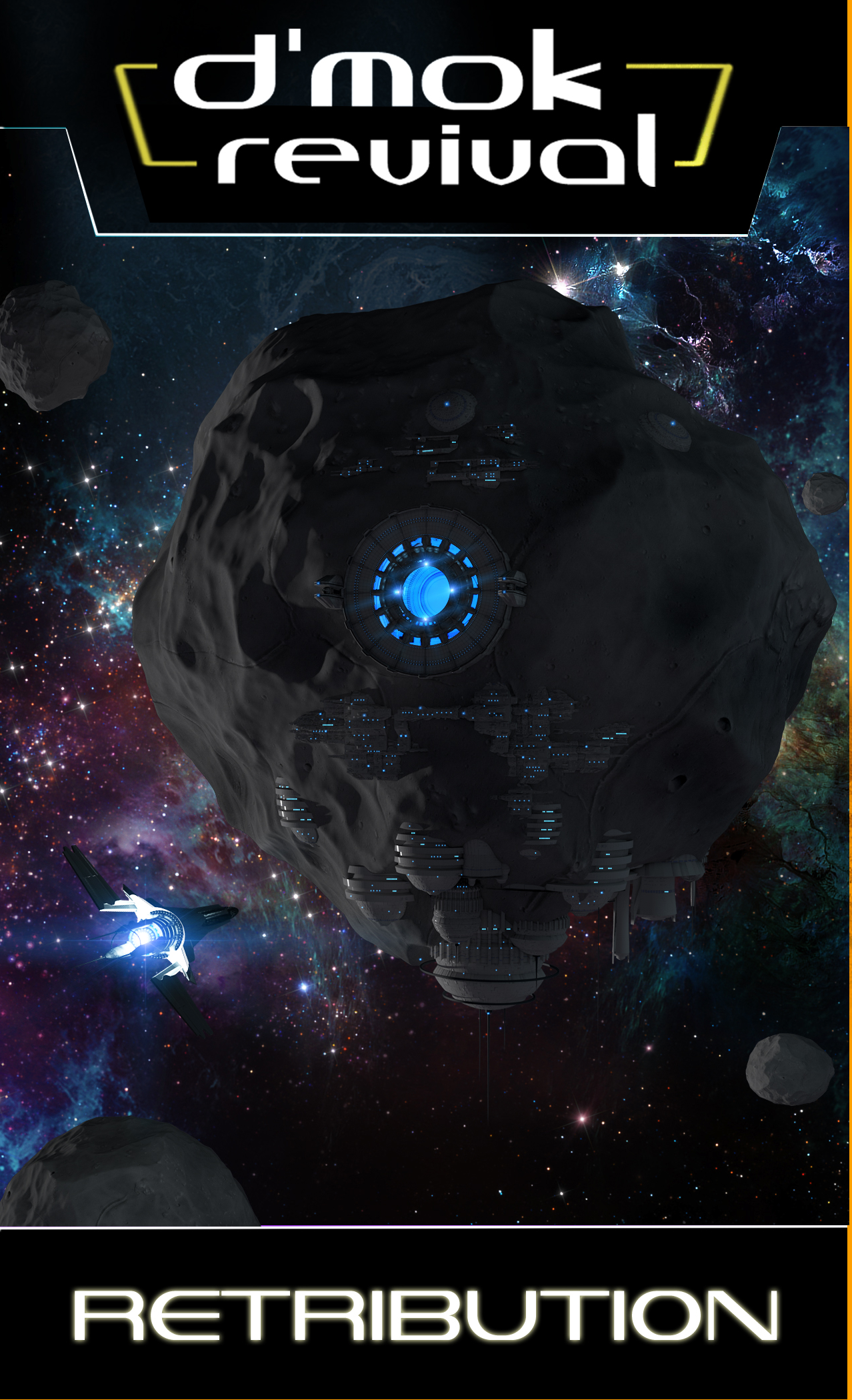
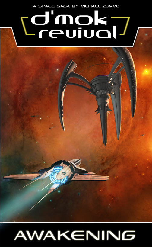
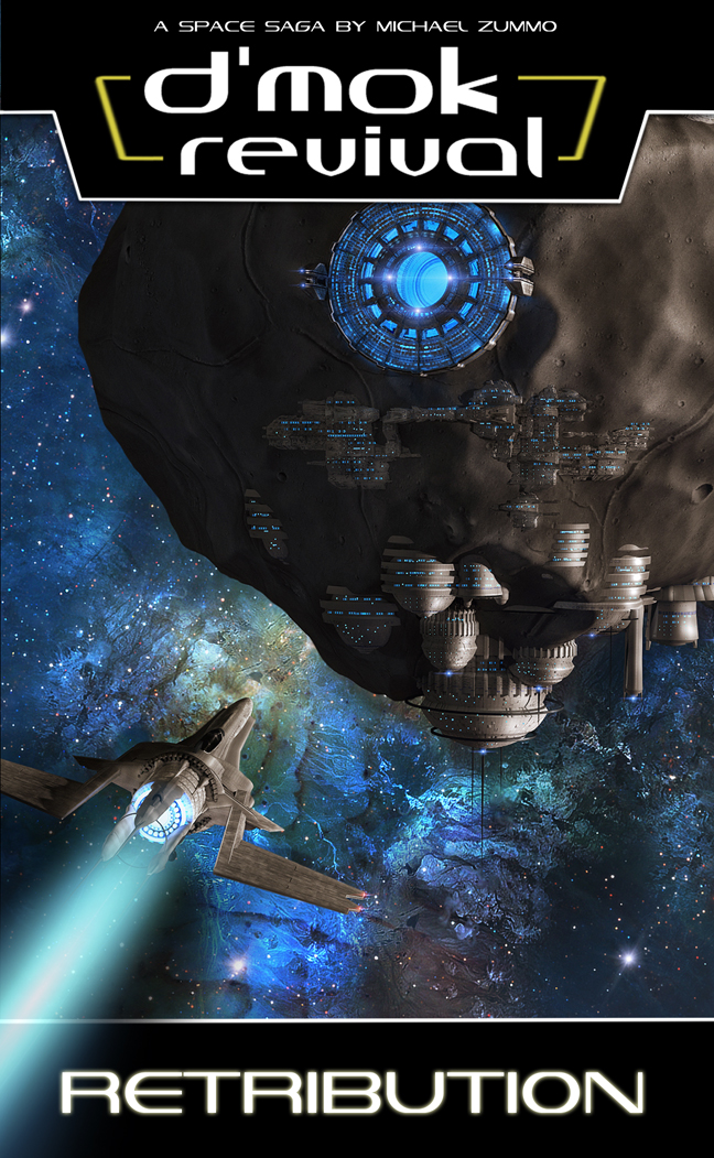
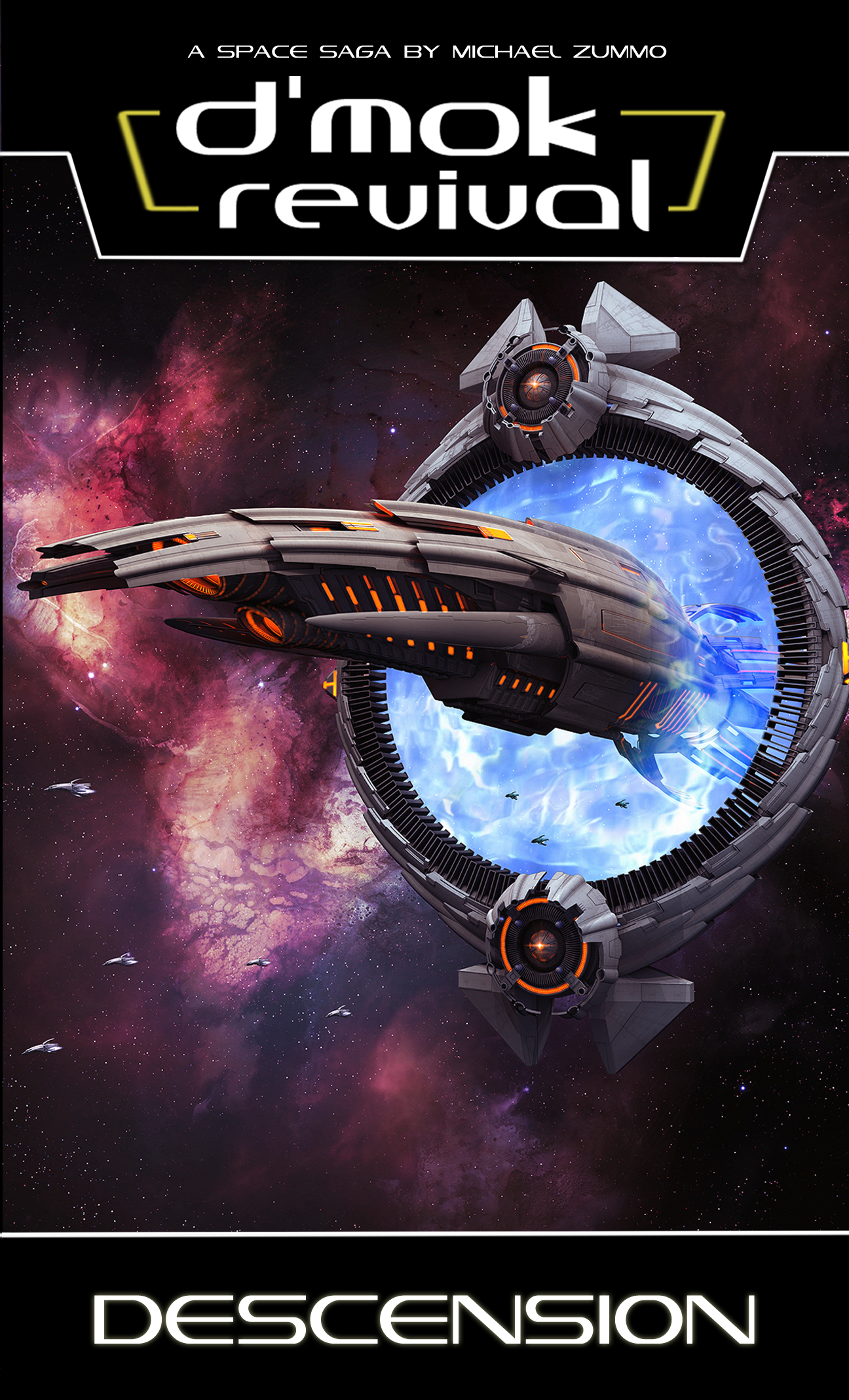
Here’s the first three novels:

book 1 coverbook 2 coverbook 3 cover


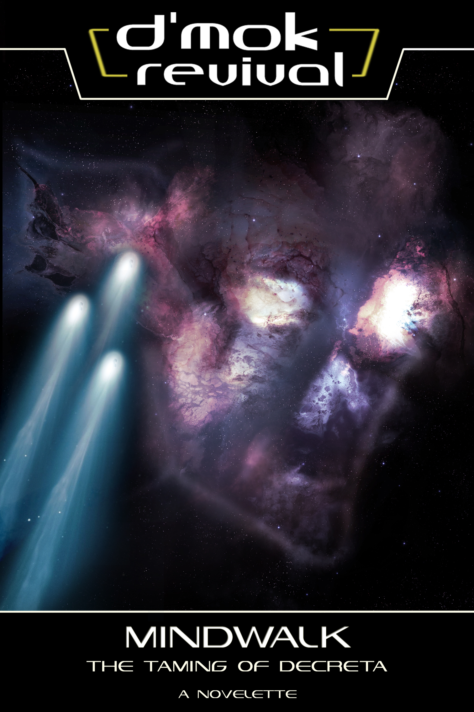
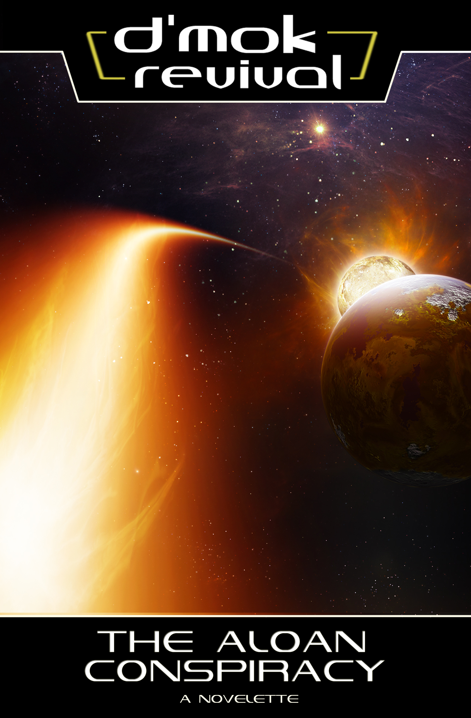
Here’s the first two novelettes:

mindwalk coveraloan conspiracy


I deeply respect and appreciate Glenn’s creative genius. I believe we iterate and evolve designs very well together. Sometimes it’s a suggestion on lighting, or transformation of a small part of something he’s already created. However, having “creative vision” is NOTHING without a creative master to make it manifest.

I’ve mentioned before the pressure that builds to have an impressive and more memorable cover book-over-book. I always want to push it and create something more amazing in the next round.

And so, here we are, “the next round.”  D’mok Revival: New Eden!

Novel number four represents a pivot in the D’mok literary universe. Many important things have changed since original trilogy, with ripple effects of how the Nukari Invasion came to an end.

So what should be on the cover?

I set forth a goal, what I wanted the cover to communicate:

  • It had to be familiar
  • It needed to focus on what New Eden looks like as it’s important the plot (starting in book 4 and moving forward)
  • I wanted to show the influence and adaptions being made based on exposure to Nukari technology
  • I wanted to represent the changing of the guard (leadership), in a way
  • I wanted the station to look capable, like someone wouldn’t mess with it, and would be able to destroy it if they tried


There’s a few things I knew already that would influence the visuals:

  • New Eden is not where Eden was, so the red nebula is out. A new location visual would be required
  • New Eden is the same “class” space station as Eden, just much larger, and enhanced
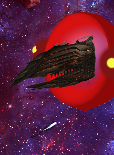
  • Examples of the Nukari technology are clearly illustrated on the third cover (the overlapping armor scales, and creature-esk look)
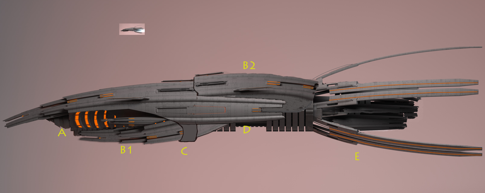
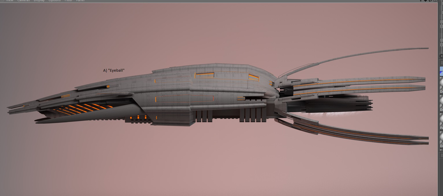
  • Books one and two featured a ship used by Mencari, so showing it again would create great consistency


The most important thing to “get right” was the station. There were many comments from the first book’s cover that I recalled.  For instance: “I’m not sure what I’m looking at? Is that a satellite or a weapon?” “It looks evil.” I didn’t want history to repeat. This time, I want to make sure people know what it is.

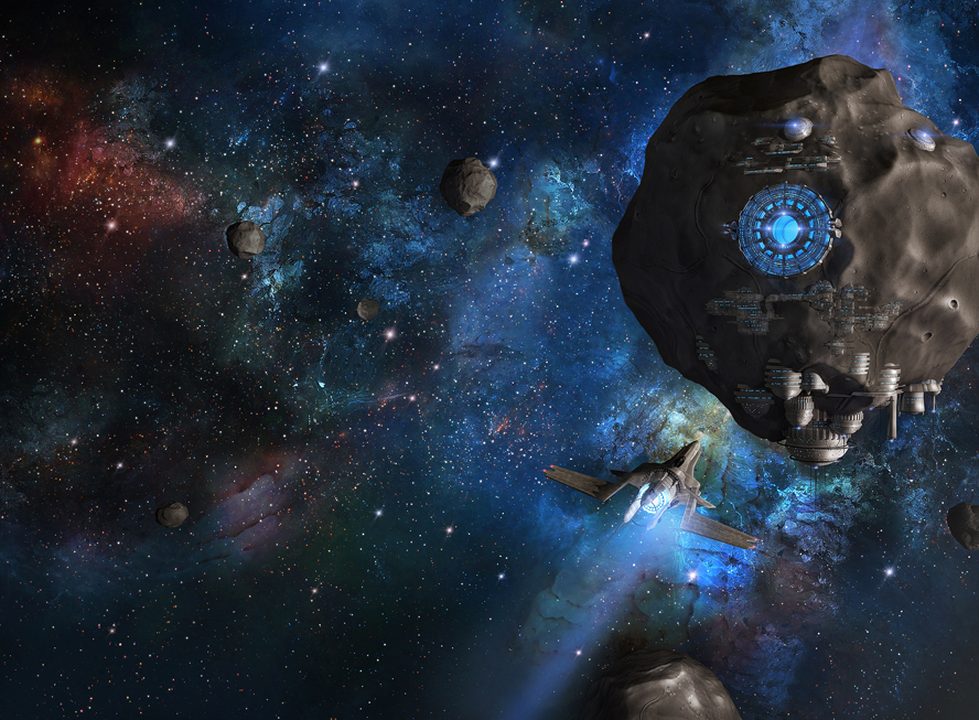
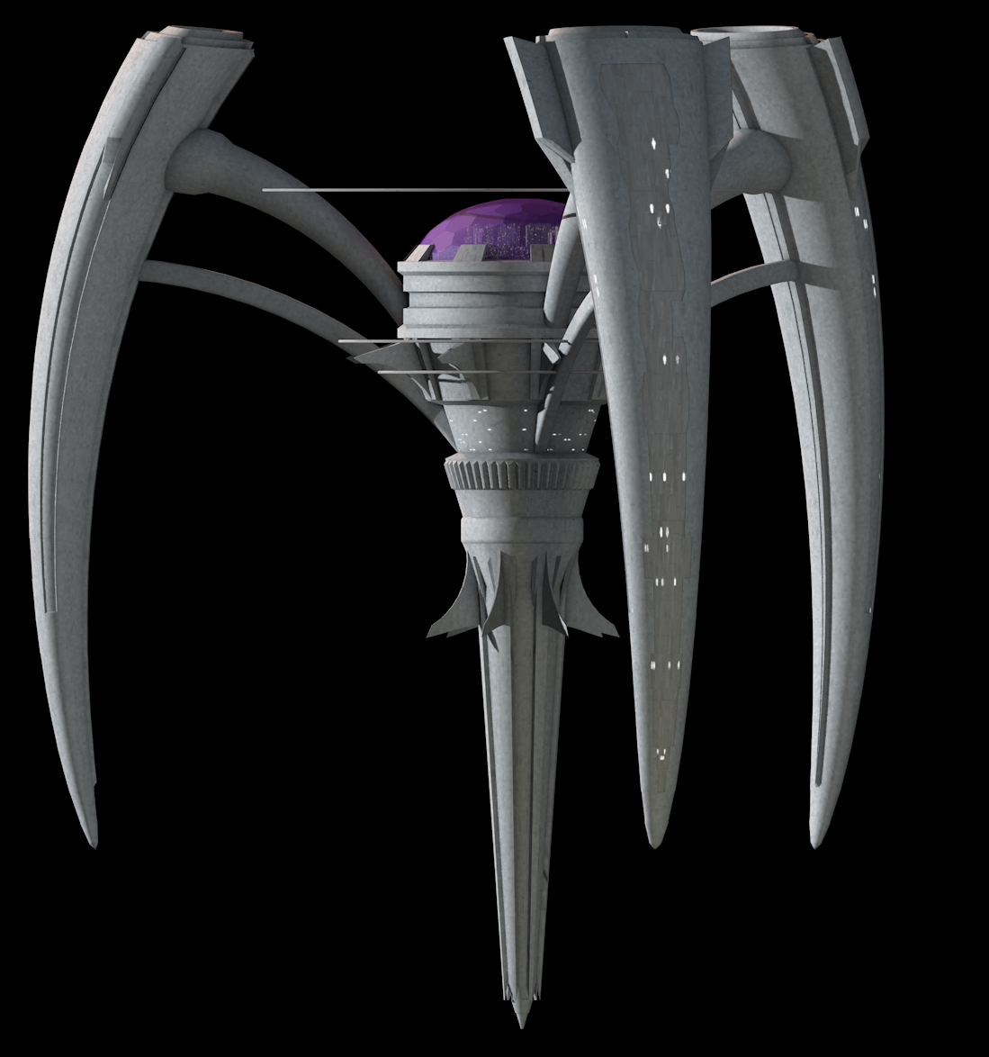
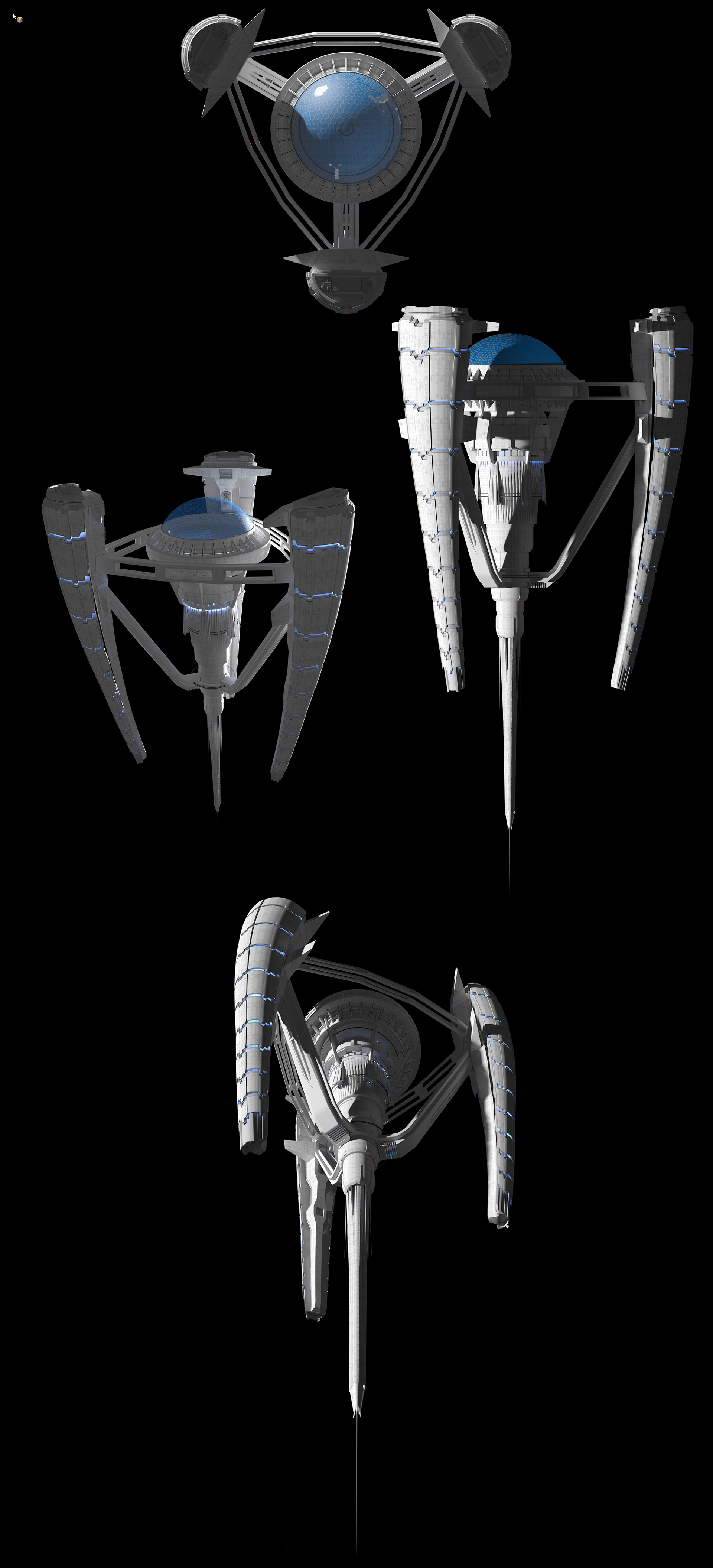
We looked at the source material.  First, the original space station:

original-stationoriginal-reference-for-email

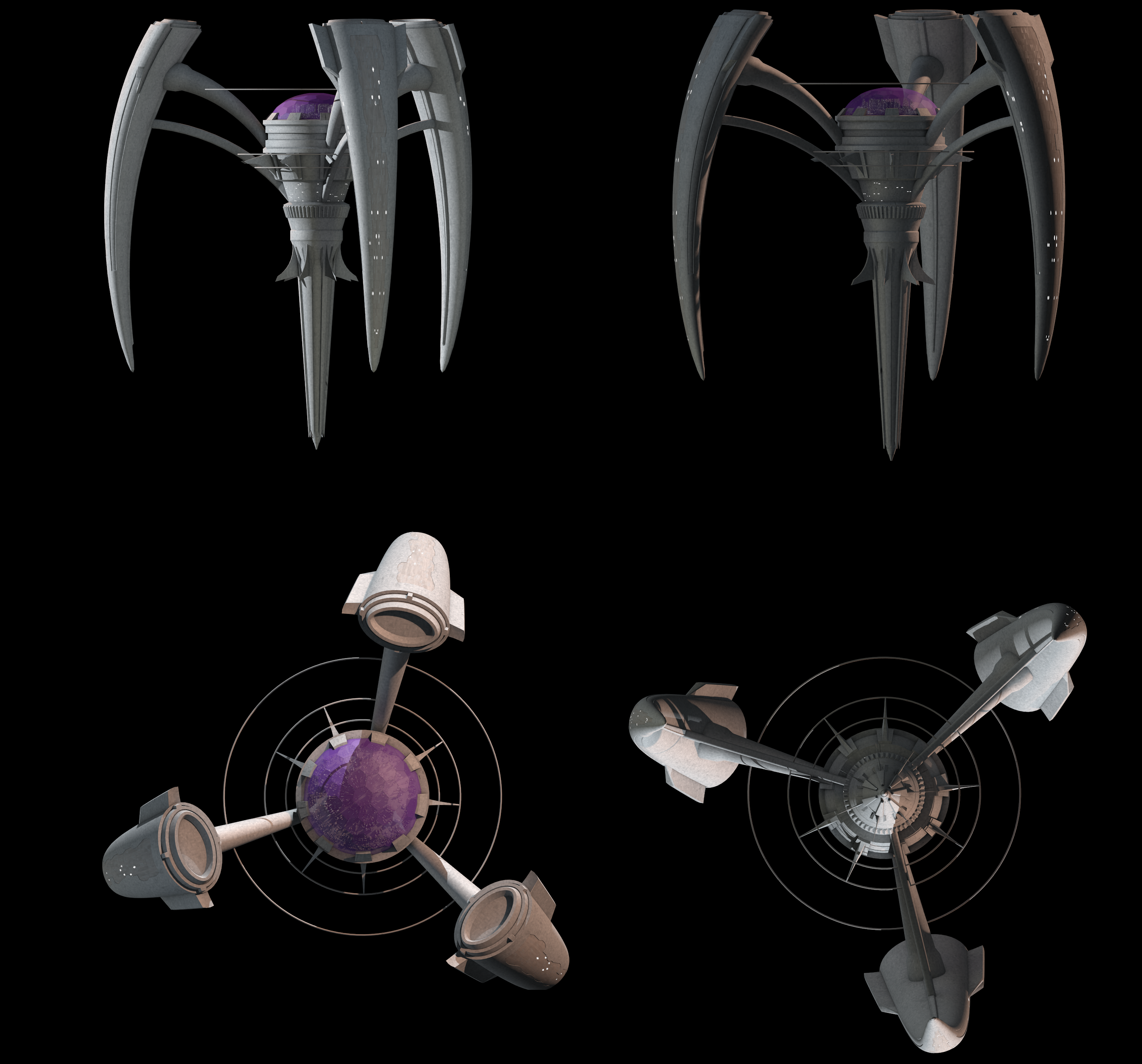
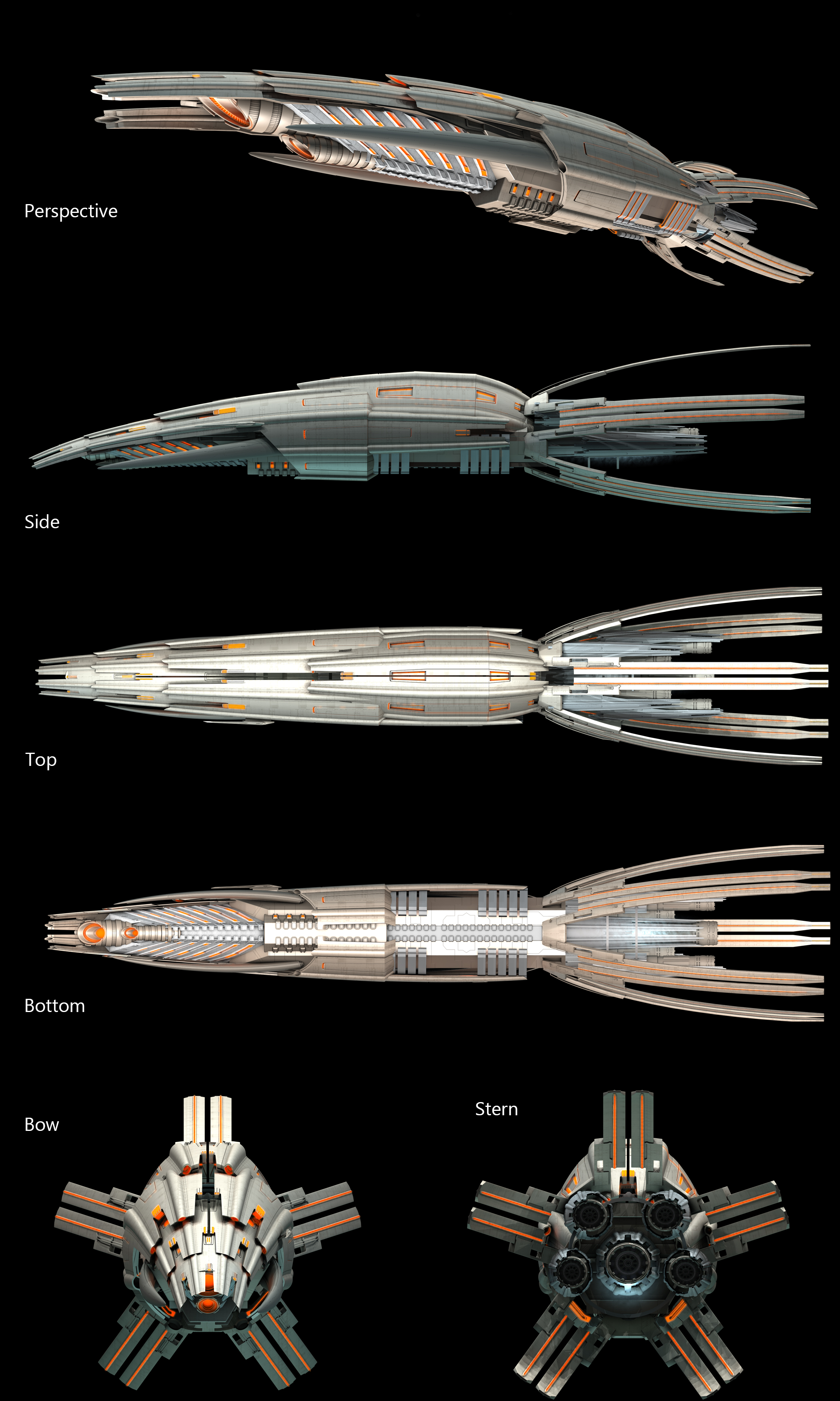
Second, the Nukari ship (The Leviathan):

Dmok-CapitalShip

Third, the Nukari space gateway:

ring


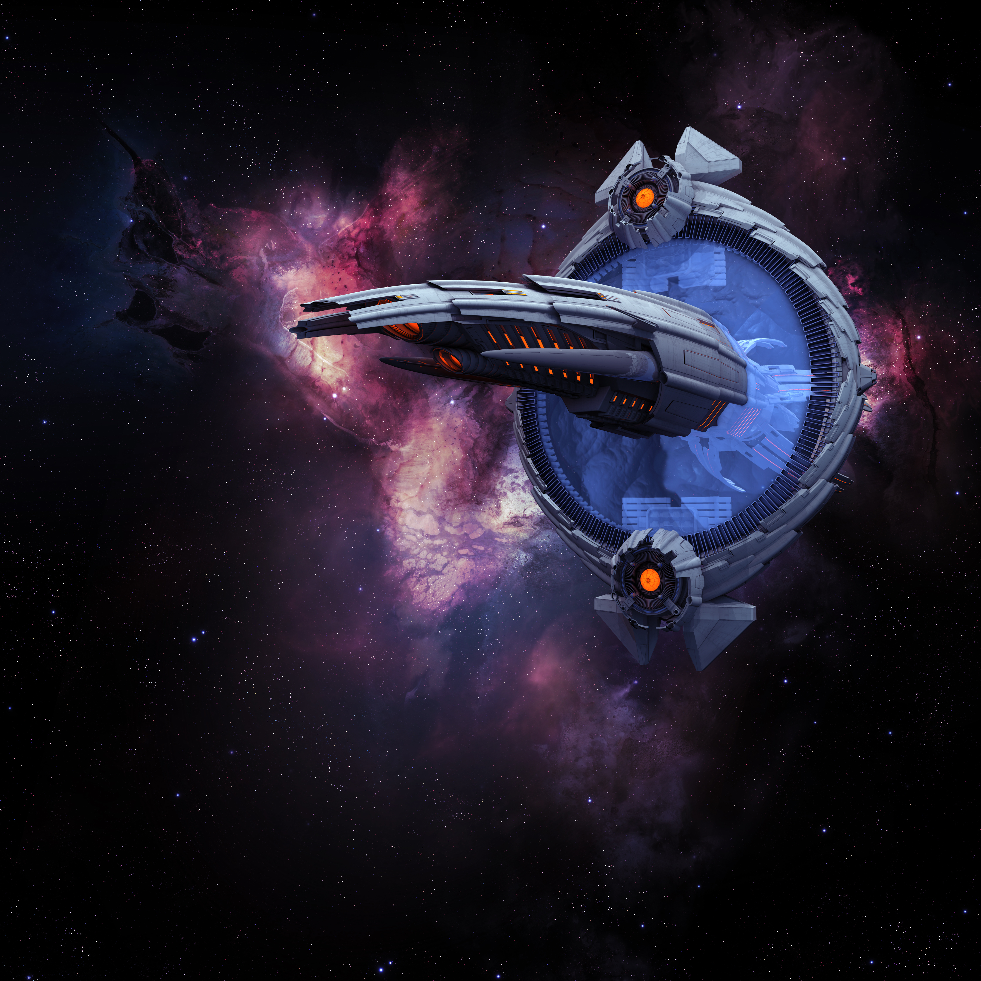
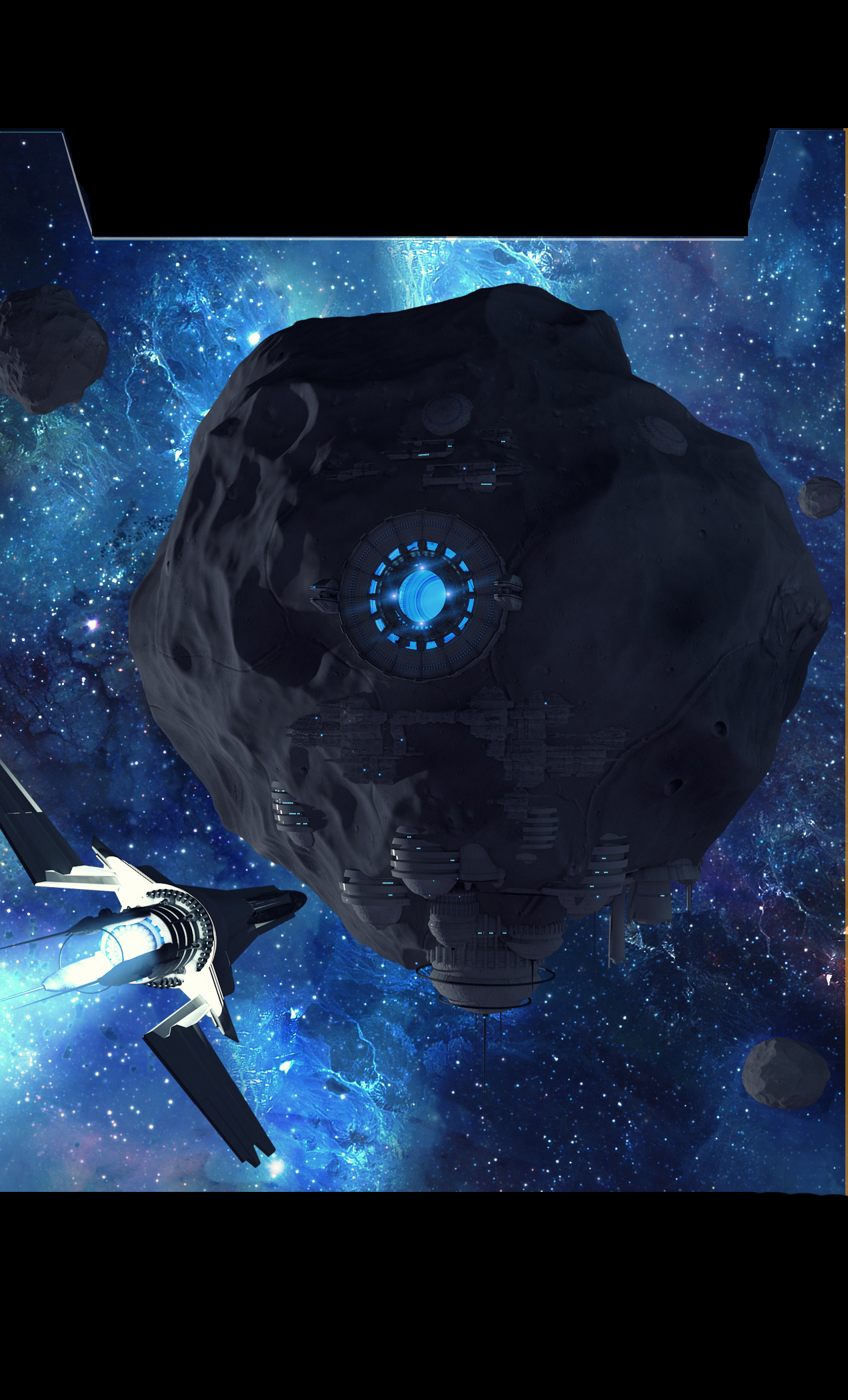
So, here was the an early approach to the design of the New Eden station:

first station version

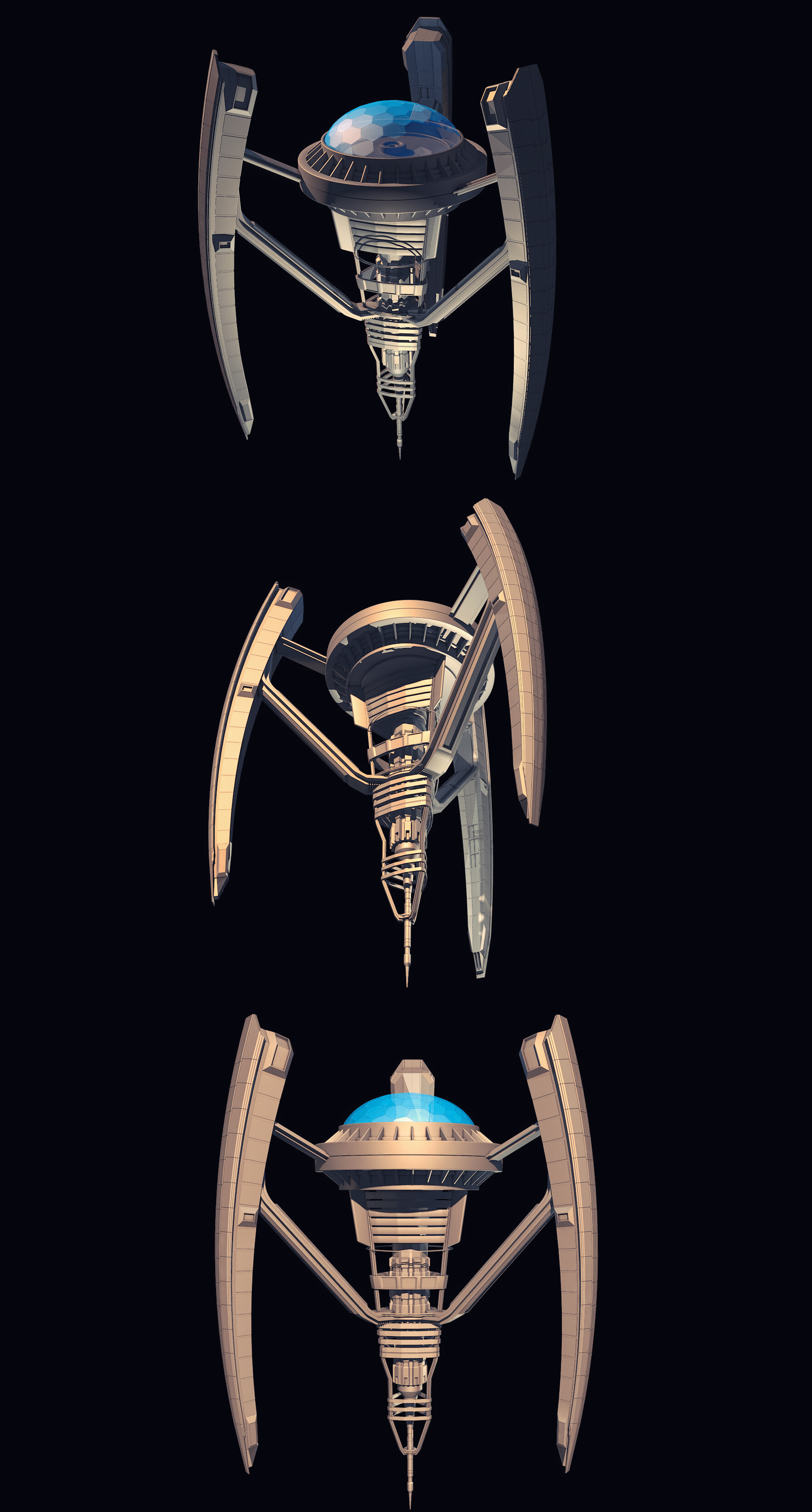
You have to start somewhere!  I loved the dome. The arms had segments, but they were very understated. The body looked still under construction to me, and I was looking for something more finished.


second version

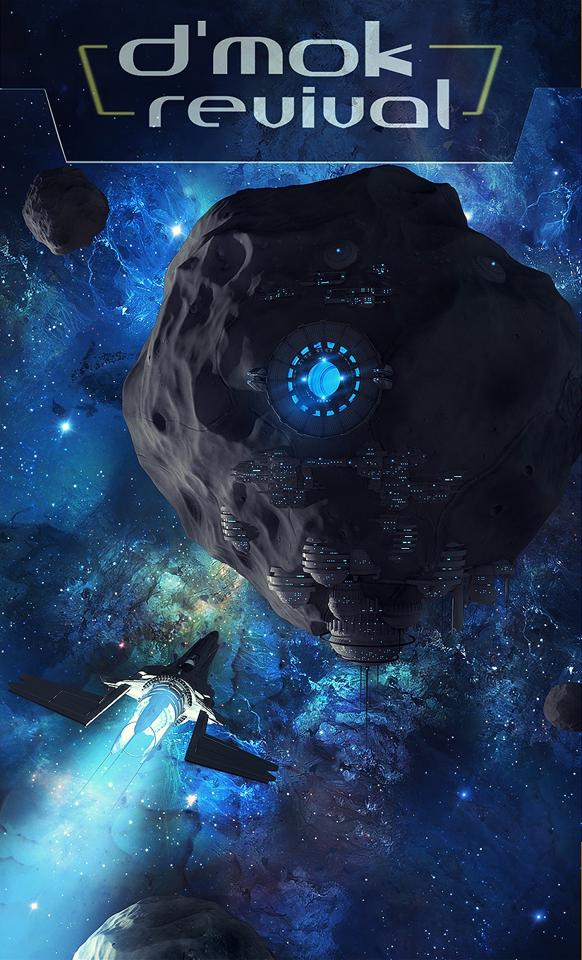
That’s a leap! Loved the direction it was headed. The upper struts that connected the arms didn’t feel organic enough (something my test group also mentioned). I liked the reshaped arms, but wanted them even bigger!


third version

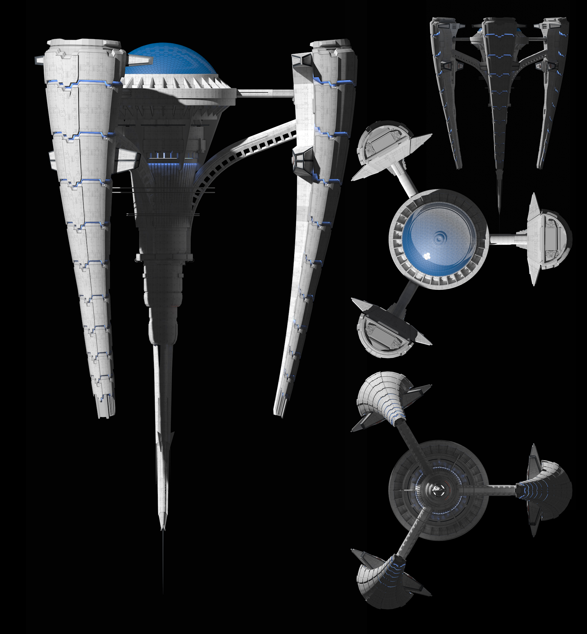
Another leap. I also loved the flairs put on the ends of the arms.  Those will come in handy later…  Though, my test group still didn’t get the direct connection to the Nukari technology with the overlapping tiles and such. There was a suggestion to change the light from blue to red like the Nukari, saying that would help create a stronger connection.

Interesting!  I LOVE feedback. Now, a quick aside, RED is usually used to represent bad things. This seems to be common across cultures in the world too. Even our own beloved scifi tend to follow this.  For instance, red blaster fire or Light Saber colors are used in Star Wars to represent the Empire or Dark Side. Hell is typically pictured as fire and red. Red auras are seen as people that have a “devil-may-care” attitude, are willing to try anything, and quick to anger. People with blue auras are seen as rare, bold, and charismatic, peacemakers with the ability to smooth out angry situations.

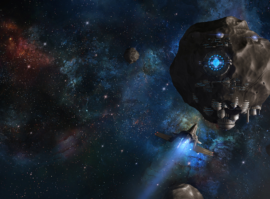
Based on this, I provided the feedback to Glenn, and this was the result.
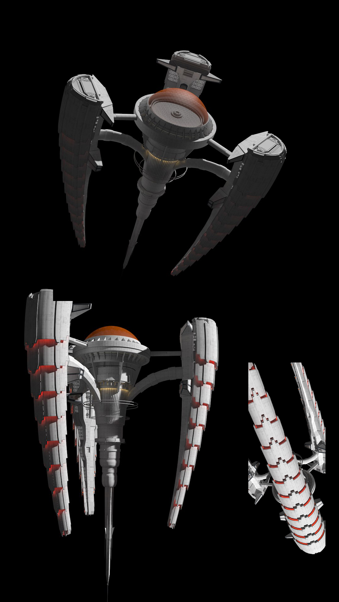
 

fourth version

Amazing!

I reviewed this with my review team. They felt it was a HUGE leap in connections to the first and third books.

I placed it into my cover blocking and played with how to display the station with respect to position and size.  Placement actually was pretty easy.  I needed to follow the “Z” eye scanning pattern people unconsciously use to read in the Western culture.

perhaps-something-like-this

I also considered putting the original ship in the lower left, following the first book. I then added a small stream of ships headed to dock into the left-arm, and one slightly larger ship coming toward the viewer’s perspective.

However, when shown to my review group they felt it was a bit TOO similar to the first book.  Then I had an idea.  Going back to my “changing of the guard” display goal, what if a slightly larger ship heading at the viewer’s perspective was the original ship from books one and two? What if I had a new ship in the lower left heading toward the station?  I’d create the Z pattern, trigger the concept of being familiar, and present the changing of the guard all at one time.  It would be EPIC!

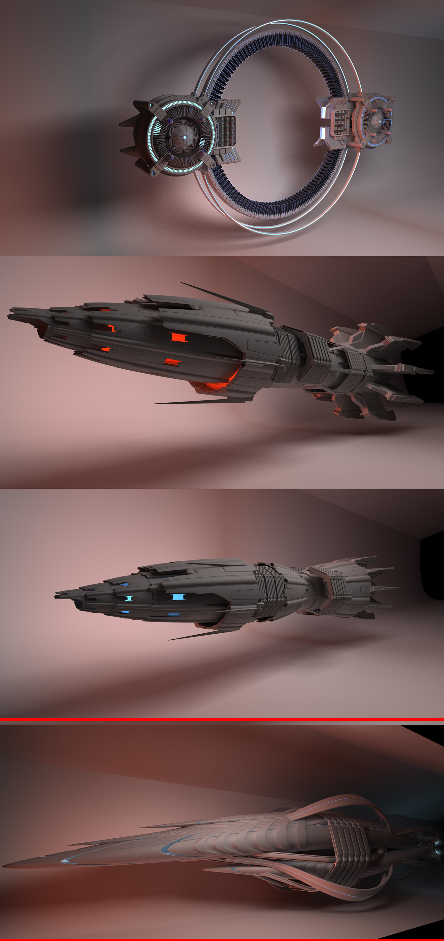
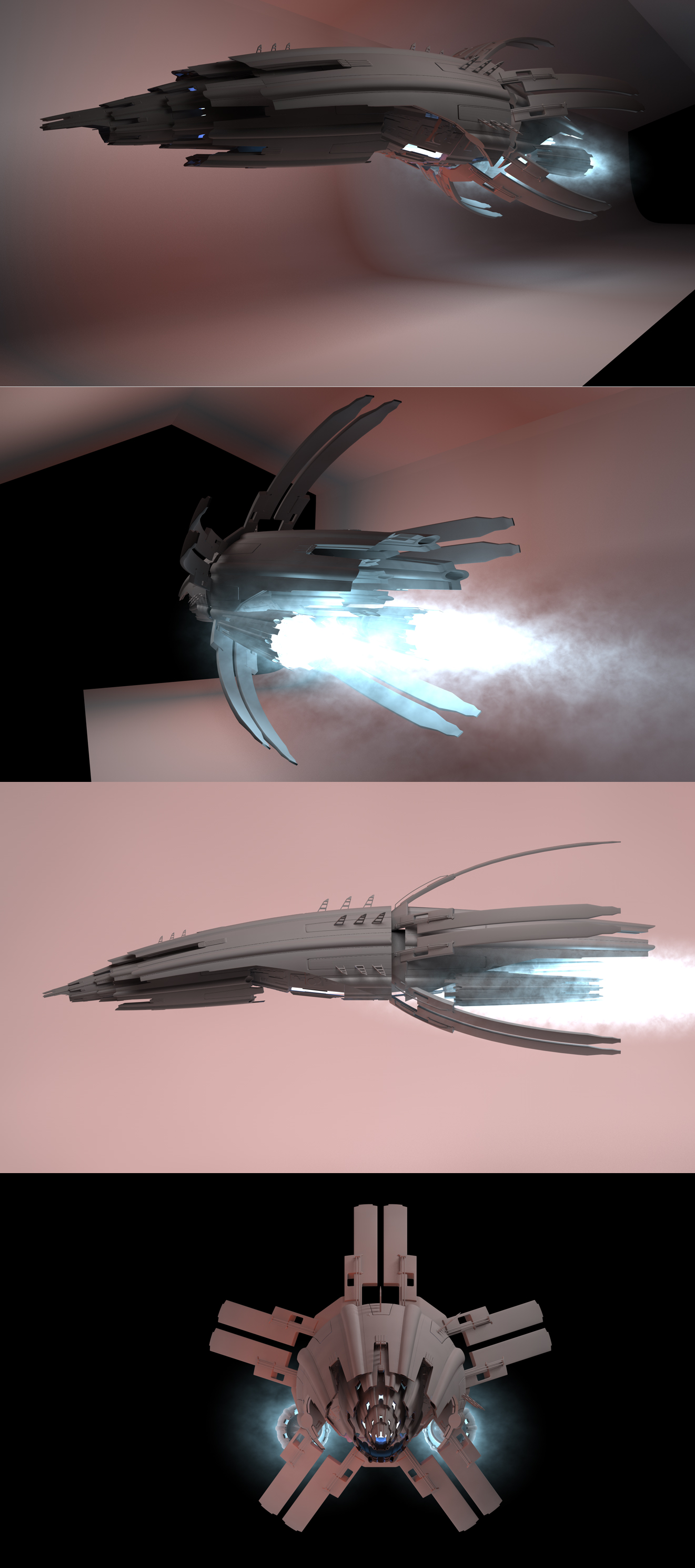
Of course, this meant I needed a new ship. It would need to be New Eden tech, with a similar Nukari influence.  We’d never designed New Eden tech before. Oh, the design challenges are endless (and awesome)!  So I mocked up a very crude concept for Glenn.

I’ll hold off on this ship for the reason that after coming up with an awesome design, the final cover composition worked best WITHOUT IT!  I know!  We spent so much time coming up with something so awesome. I’ll use it, just not for this cover. It’s the “Lexor Class” ship that gets mentioned starting in book 4, so there should be lots of opportunity to use it.

On to working on the final book 4 cover.  Together we mocked up a few different ideas (locations, angles, position of elements).

I wanted to go with a green and blue nebula. This would be distinct from the other major novel covers, and contrast with the orange-red glow from the station.

early rough

But one design really popped past the others. I loved (and so did my review team) loved the station on an angle, in a more ominous presentation.

Of course, this was just the beginning of the refinement.  Here’s a list of things we tweaked through numerous designs:

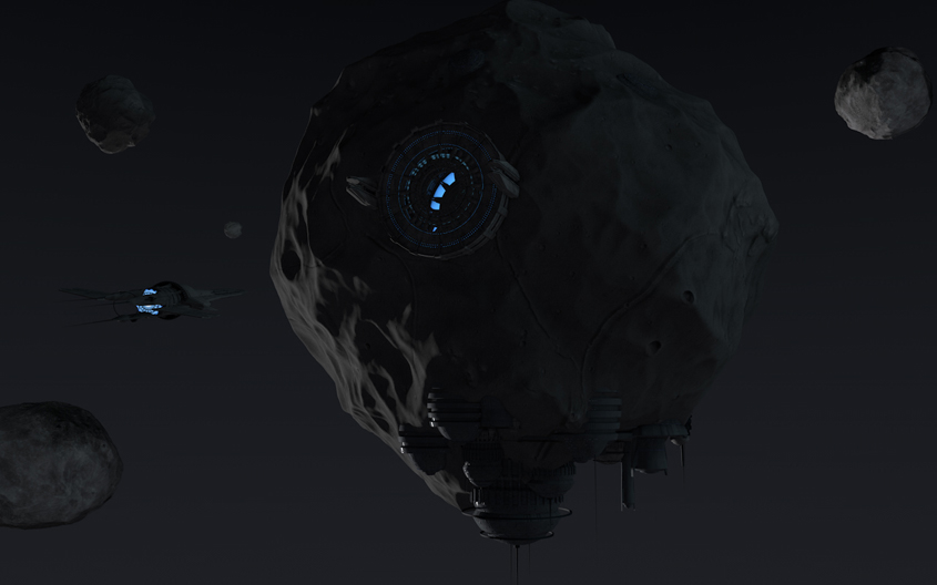
  • Presentation of the city under the dome (Rinow city)
  • Window placement on the station
  • Red glowing light from other places than the arm

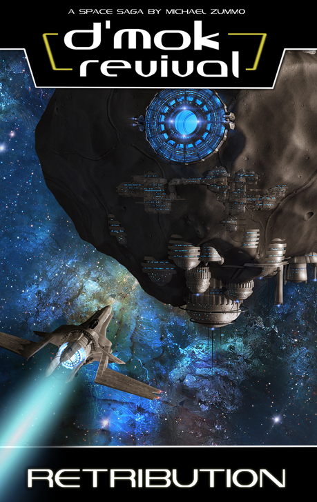
Here’s the final version of the cover:

final cover

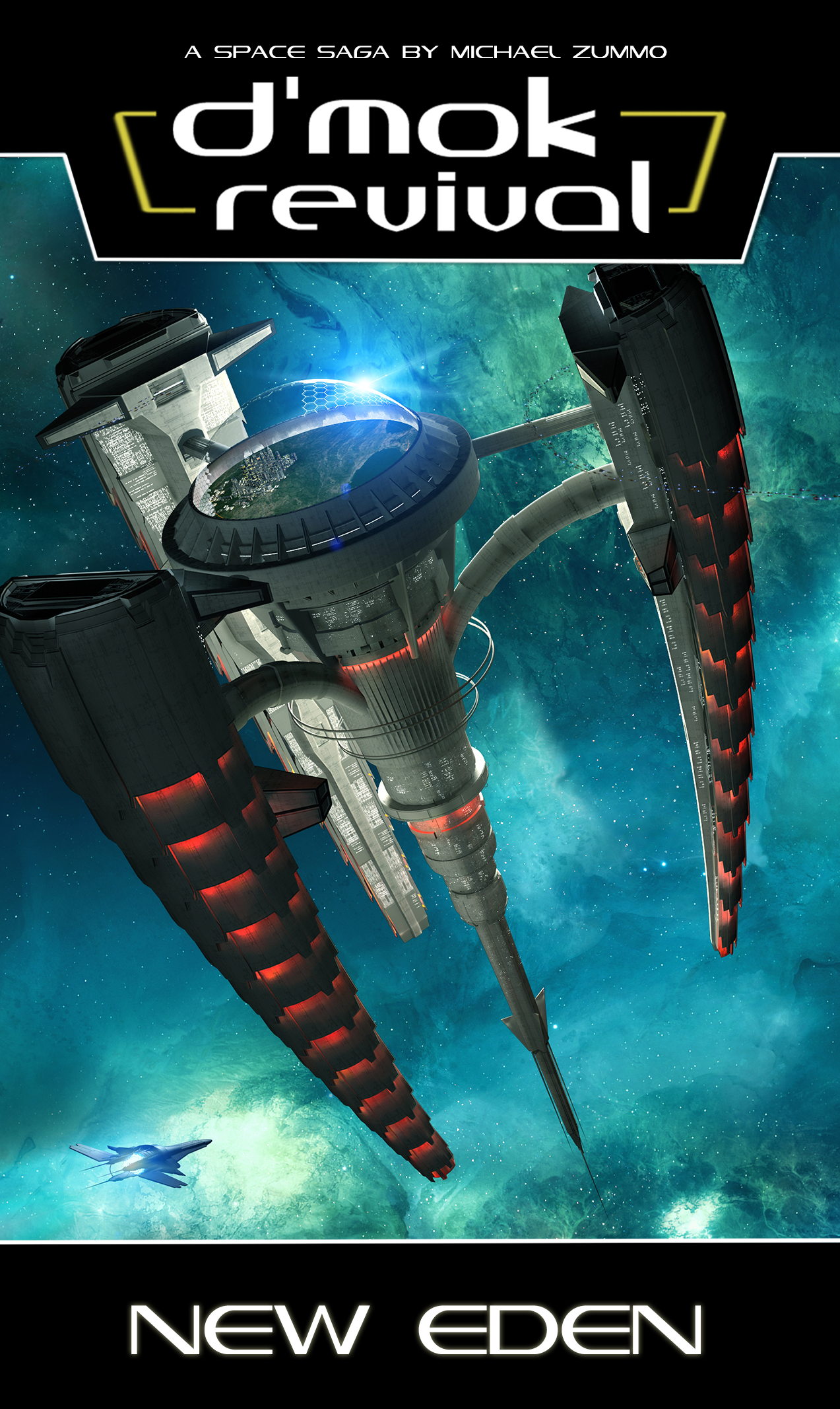
There’s so many fine details about this station and the surrounding area of space. For instance, the gleam off the dome, the trail of ships going into the arms, the windows on the station… I think it’s amazing and beautiful.

In the end, I believe I accomplished all my main goals for this with exception to a changing of the guard. However, one could argue that so much obvious Nukari technology shows something is up at New Eden…  Exactly what I want people (that are familiar with the series) to wonder about.

So, that’s the story about book 4’s cover development!

D’mok Revival: Descension’s cover design

The pressure was on. The Awakening had a fantastic cover. I loved the nebula and the arachnid-like space station. Then came the incredible visualization of the asteroid base for Retribution’s cover. After two amazing starts, I fretted about how to keep the trend going–even topping the previous ones!

What to put on the third cover? It had to be visually striking, invoke an emotion. I thought about the core story of the third book, and the tension slowly building over the course of the trilogy. Inspiration struck! It was obvious. I had to show the Nukari armada.  I smiled as a vision appeared in my mind.
20141219_075600

I scrawled down the image on a scrap of envelope paper.  Now, for those that have not read the third book yet, this is NOT a spoiler for the following reasons: 1) their armada has been threatening since the first book, 2) the back cover tells you the armada comes out swinging, 3) the prolog at the beginning of the book talks about the armada and a gateway being built.  I won’t provide any spoilers or additional information about the scene than what I just mentioned.

Now, beyond the general descriptions of Nukari ships, no rendered versions of their vessels existed!  If I wanted to display them, we needed a design. Then there was the gate. There were aspects mentioned in the book, but nothing out-rightly specific about the visuals. It’s always fun to provide enough information to let the reader visualize their version in their mind. But, if I wanted that on the cover too, it would also need to be visually concepted.

So began the design for Nukari ships. I wanted them to be aggressive, dangerous looking, and capable. They needed to look like they could take a pounding, and deal great damage.  I made a quick list of the things that instilled fear people, as its the effect the Nukari would want their ships to have on opponents.  I looked to our “lizard brains” for stimuli there…  There’s 6 questions your lizard brain asks of every pieces of stimulus throughout the day: 1) can I eat it, 2) can it eat me, 3) can I kill it, 4) can it kill me, 5) can I have sex with it, 6) can it have sex with me (perhaps unwanted).

A few obvious criteria jump out: can it kill me, can I kill it, can it eat me.  Then I went to nature, what types of nature’s gifts create natural offenses/defenses for animals? Skin texture, natural body covering (scales, shells), body coloring, claws, teeth, a solid body structure, muscular composition, body size, and distance based defenses.  I then performed an animal image search on Google looking for various creatures.

After searching various creatures with tusks (boars and mammoths), horns (rhinos), and sleekness (black panther), I came across the Pangolin.

tumblr_mcpl92H8Bj1rxphab[1]

http://media.tumblr.com/tumblr_mcpl92H8Bj1rxphab.jpg

Beautiful creature.  It doesn’t look very deadly, but it looks well defended with its sturdy body scales.

This was the upgraded vision…

cover-3-first-concept

I sent the concepts off to my amazing 3D designer, Glenn Clovis, who began to render a number of options.  Some were more industrial, some more organic… Here are two of the many versions he did.  I’m showing these because they’re both officially a part of the D’mok Revival universe and protected assets (thanks to copyrights).  Yes, the ship on the bottom will be used–I’m not tell where, when, or how yet… But I do know.)

Dmok3_StagateAndConcepts

I really loved the slick, smooth, almost squid like version (at the bottom).  But it didn’t “feel Nukari” to me.  The overlapping armor layers of the top ones were like the Pangolin, and felt great.  I knew this was the right direction.

He reworked the design based on some feedback.

Dmok3_CapitalShip_N
SO COOL!  Though the initial ship seemed too small.  Perhaps it would make a great fighter, but not the big “Laviathan” ship mentioned. I provided some feedback, and the next evolution appeared. He also started to apply the overlapping armor layers to the gate.
gate render
I liked where this was going. It still looked too vulnerable in the middle. I also wanted the front to look like “a deadly face.”  So we swapped the front cannons with longer, tusk-like components.  I also suggested we continue the layers of body armor to the rear of the ship.
revised-for-glenn
I made some suggestions like the following…
ship-size-contrast
Glenn took that and iterated.  To simply the design, we dropped the side cannons, and added a larger front cannon (inspired by the Bird of Prey from Star Trek).  After review, I thought it was cool, but had him add a second smaller one directly under it (it would have its uses).  We ended up with the following design:
final-annotations

There, now that we had the ship, we could go after the gateway.  I wanted the designs to look related since the Nukari made both the ship and gate technologies.  After a few revisions, the overlapping armor was applied to the design.

Now we had to combine them.  We investigated a few angles (head-on, from the side, from an angle, etc.).  I wanted a dramatic scene.  My very first vision had an extremely closer perspective looking up at a sharp angle. We ended up being a little further back since the up-close view looked a bit distorted.  I wanted people to see the amazing detail of the ship, gate, and future nebula.
Glenn assembled the complete picture.
dmok3
The nebula was instantly striking (he’s so good). There was some lighting tweaks, and some changing of the effect within the gate. In the end, to provide scale, I thought we could go back to the “fighter” design and add some in.  It would make it look like an armada coming through the gate (Which was the point), and help explain the big ship was — BIG.
book-3-wallpaper

And BOOM!  It’s one of those things where you see it and go, “THIS IS IT!”  I was blown away.  I was thrilled!  We’d done it again. I love collaborating with Glenn.  He’s a visionary, so very talented, and easy to work with (and patient with me).

I hope you enjoy it as much as I do!

Creating your book cover

The cover is the first place you can capture a reader’s imagination and make them want to see more about “that.” You have mere seconds as people scan across thumbnails online, or across a book shelf to snag their attention. People ALWAYS judge a book by its cover first. In fact, the brain is optimized to discern appealing things in an instant.

Getting the contents of a book is very important. However, if the cover isn’t epic, if it doesn’t snag people’s attention, getting people to read your content will be a far more difficult task.

I thought I’d go through and talk about the process used for the second cover.

  1. Build on knowledge of the genre, researched the first time around
  2. Leverage what I’ve learned from book 1’s cover
  3. Build the series identity
  4. Tapping action of book 2
  5. Initial concepts
  6. Focus group testing and iteration


BUILD ON KNOWLEDGE

When I first entered the science fiction space (pun intended), I researched the major series. I was interested in aligning my visuals and branding with space operas and household science fiction names. Specifics included: Star Wars, Star Trek, Firefly, Babylon 5, Dune, Battlestar Galactica, Stargate, and so on.

I analyzed logo design and placement, common elements on covers, where they put series versus book names, how they designed their book spine, how much information they put on the cover, etc.

There were clear patterns. A bold series logo was at the top, with book name directly under it, or on the bottom of the cover. Stories with well known characters used illustrations against a space backdrop. Others focused on the technology showing ships or space stations. More imaginative ones also tried to illustrate a specific moment in the book. Back covers were sparce, with some text, little visuals. Spines typically displayed a tiny visual, mostly logos and book names.

As a side note, I also reviewed fantasy covers. Those are typically beautiful and very visually engaging. Even the spines have amazing artwork.


LEVERAGE

The first cover had a show-stopper scene with an intense background, ominous space station, ship heading towards it. People were instantly drawn to it. Hundreds of people at ComicCon Chicago didn’t know anything about my series, but they saw the visual and came over to find out. This showed me how important the main visual was to get right! The other aspect I learned was to keep cover elements simple and focused. Don’t over clutter the main visual. Allow a few, larger elements to strike hard and pull them in. Most of all, drive their curiosity. Make them want to “visit” that place (by reading your story).

After launch, I was frequently told how understated my series name was on the first cover. Also, while the book title at the bottom was well sized, it wasn’t chaining with the series name as I had hoped. Another weakness was the lack of review quotes and other things to legitimize the work, or give people context for how others interpret the story.

I have a number of awards I could put on the cover: Amazon top 20 best seller in Alien Invasion, and 5-star winner by Readers’ Choice. But those came after the launch. Admittedly this is a tough one for me, as professional reviewers still won’t touch the series.

Nevertheless, you may have professional reviewers. If you do, try to fit in a few key words or phrases from their review on your cover. Just look at the top 40 book shelf to see how the pros position quotes.


BUILDING SERIES

I’m working on creating a particular look for the series. A cool background, a major location, and a main ship is the approach I’m going to use for covers of the first trilogy. I’m also going to use a color scheme approach. The first book’s nebula was red, this one will be blue. Depending on the feel of the third book it may be more violet.

I want to create a consistency with the visual appearance. This means the logo will be at the top, there will be a black barred off area on the bottom for the book title. The spine will have the “wrap-around” space scene at the top and bottom, with the logo and book title in the middle. The back will have a barred off top and bottom showing the “wrap-around” space scene with Nukari and D’mar logos in the corner. The descriptive text will be on black. It creates a specific, streamlined look that I really like.

I have, as of the second book, updated the logo based on the feedback I received. It’s cleaner and larger. I’m going back and modifying the first book to support this update to the branding.


TAPPING ACTION

As I mentioned before I want to visually engage readers, and pique their interest. The first book shows the Trading Post, a major location throughout the series. The second will focus on Osuto’s asteroid base. As another major location for the series, I wanted to show people what it looks like in addition to wanting them to “go inside” and experience what it’s like to be there.

For now, the same ship from the first cover is being shown again. It was assumed to be either Osuto’s ship or the one recovered from the graveyard of ships in the first book. Technically, it could also be Ujaku’s ship. Which ship it is has not been finally decided yet. Strange right? Let’s just say, for now, I’ve left it up to the reader to determine which it is. I’m guessing most people assume it’s Osuto’s ship.

Glenn did an amazing design that shows more of the asteroids around it, and a sweeping nebula.
INITIAL CONCEPT

When Glenn and I started working on the second cover, the first thing I did was a crude wireframe design showing the desired blocking for visual elements.
original_sketch
See how crude this was? I only wanted to get the idea across to Glenn. He’s the one that works the magic. I also sent along images of similar concepts of asteroid bases from Google images. Surprisingly, there were few examples of asteroid bases, much less ones that aligned with what I wanted. Many had an element or two, but nothing like what I wanted.

As a side note, it’s important when designing a cover to leverage the visual “Z” scan westerners do with their eyes when reading. They start in the upper-left, move right to the far edge, diagonally down left to the lower left corner, the right again to the lower-right corner. These are basic usability concepts that I leverage in software and Web site design all the time. This is also the pattern used in the first book, and it performed well.

For the second cover, I placed the asteroid base in the same position as the space station, and the ship in the same location.

Glenn went ahead and did an initial version of the asteroid base.

first_mock-up
AMAZING START! I had some feedback about additional build-out for the station, and creating more of a connection between the massive space dock and the lower base segment. Then he added in the nebula and some effects.

first_nebula

The nebula was very cool, but didn’t have the radiant blue aspects I had in my head. The base and ship was also cast into shadow, and lost the great detail there. I know printed images tend to go darker than they appear digitally, so I was concerned the image would literally get lost when it went to the press.
first_blue_nebula

This version really made things pop. But the eye was really drawn directly down the left side of the image. In fact, the eye rested on the ship, and the viewer actually missed the station buildings at the bottom of the asteroid. Lighting is so important! I thought adding some building lights would also bring the lower section of the station to life too.

second_blue_nebula
The lights were a cool addition. The ship was angled to look like it was headed to the dock. To me the ship got lost because in all the amazing detail of the nebula. Among the changes I suggested included changing the source of the light so it illuminated more of the right size of the asteroid.

changed_light1
The difference was striking! Glenn enhanced the lighting to bring some features out, and boom, done!

final_lighting


FOCUS GROUP

Each stage of design I tapped my “review team” as I call them. This is a combination of my email group of fans and friends, and then the D’mok Revival Facebook page. Getting my readership’s reactions is very important to me! I was able to quickly get a read on how design performed, identify what people thought was weak about it, etc. Patterns in responses were clear. Those that care about your series also love contributing, so ask them!

Side note: don’t forget to thank those amazing people in your book too!

You can’t be afraid to iterate. You can’t be afraid to talk to your audience. Remember, you get one shot at releasing a book. Make sure when it hits, it hits the mark. Reviewers and readers will not be kind when you launch a product, so help yourself now and get feedback before there’s a train wreck.

In addition to amazing fans, I have a number of friends who are both science fiction fans, and fans of honesty. They let me know exactly when something didn’t resonate with them. At one of our board game nights I showed them the latest cover. They suggested, while the nebula was cool, to really zoom in on the asteroid base. The concept was to make it more intense, spotlight the amazing visuals. I thought the idea was great. I made a number of zoomed in versions and took to Facebook. The community instantly responded and sent me their thoughts. Again, clear patterns emerged.

The cover you see today is a result of vision, amazing artistry, and key feedback from the D’mok community.

final-cover-design

Okay, you may notice the contrail is more pronounced. The truth is I LOVED the contrail from the first book.  I actually lifted it from the Photoshop file and superimposed it on this one.  I also added a little shadowing effect to both highlight it and create more of a wake disturbance behind the spaceship.  It also draws the eye to the left corner, supporting the “Z” visual scan for the viewer’s eyes.


FUTURE

Right now I’m beginning the process on book 3. Taking my own advice above, I’ve started early sketches. Even though the launch party for book 2 is July 19th (next month), I promised to get book 3 out by the holiday season. I need to keep the momentum going and move on it. Once book 2 is out, I’ll start getting cover feedback from the community on the third edition.