Creating the fourth novel cover
So, here we go again! After releasing two novelettes in 2015 which extended the D’mok literary universe, it’s time to tackle the next novels. These days, you don’t really “do” one book anymore. The expectations is TRILOGIES. Yes, this means there will be two more in the D’mok Revival series coming. 😉
I promise to write about the process of taking my fourth manuscript and evolving it into its final form in a future blog. This post is specifically about the new cover.
For some quick background, I am very proud of the five covers done to date. I’ve had the distinct honor of privilege of working with Glenn Clovis, an amazing 3D artist. He’s brilliant, incredibly talented, and PATIENT! This is important, as working with “a client with a vision” (like myself) is NEVER EASY. Not to say I’m a high maintenance person per se, but I’m trying to create a specific look and with that comes some creative direction.
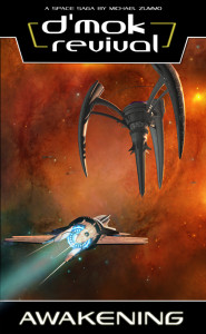
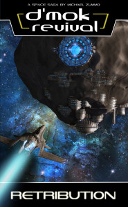
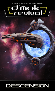
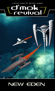
Here’s the first three novels:
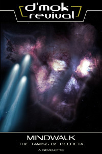
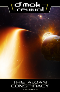
Here’s the first two novelettes:
I deeply respect and appreciate Glenn’s creative genius. I believe we iterate and evolve designs very well together. Sometimes it’s a suggestion on lighting, or transformation of a small part of something he’s already created. However, having “creative vision” is NOTHING without a creative master to make it manifest.
I’ve mentioned before the pressure that builds to have an impressive and more memorable cover book-over-book. I always want to push it and create something more amazing in the next round.
And so, here we are, “the next round.” D’mok Revival: New Eden!
Novel number four represents a pivot in the D’mok literary universe. Many important things have changed since original trilogy, with ripple effects of how the Nukari Invasion came to an end.
So what should be on the cover?
I set forth a goal, what I wanted the cover to communicate:
- It had to be familiar
- It needed to focus on what New Eden looks like as it’s important the plot (starting in book 4 and moving forward)
- I wanted to show the influence and adaptions being made based on exposure to Nukari technology
- I wanted to represent the changing of the guard (leadership), in a way
- I wanted the station to look capable, like someone wouldn’t mess with it, and would be able to destroy it if they tried
There’s a few things I knew already that would influence the visuals:
- New Eden is not where Eden was, so the red nebula is out. A new location visual would be required
- New Eden is the same “class” space station as Eden, just much larger, and enhanced
- Examples of the Nukari technology are clearly illustrated on the third cover (the overlapping armor scales, and creature-esk look)
- Books one and two featured a ship used by Mencari, so showing it again would create great consistency
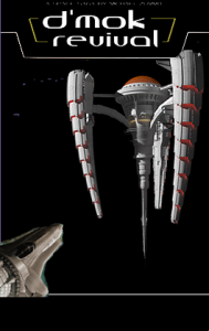
The most important thing to “get right” was the station. There were many comments from the first book’s cover that I recalled. For instance: “I’m not sure what I’m looking at? Is that a satellite or a weapon?” “It looks evil.” I didn’t want history to repeat. This time, I want to make sure people know what it is.
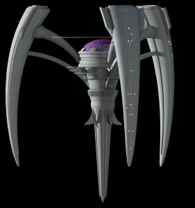
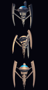
We looked at the source material. First, the original space station:
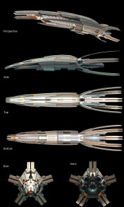
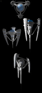
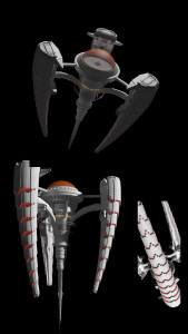
Second, the Nukari ship (The Leviathan):
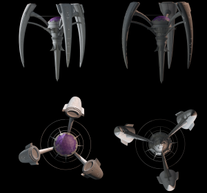
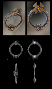
Third, the Nukari space gateway:
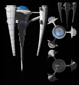
So, here was the an early approach to the design of the New Eden station:
You have to start somewhere! I loved the dome. The arms had segments, but they were very understated. The body looked still under construction to me, and I was looking for something more finished.
That’s a leap! Loved the direction it was headed. The upper struts that connected the arms didn’t feel organic enough (something my test group also mentioned). I liked the reshaped arms, but wanted them even bigger!
Another leap. I also loved the flairs put on the ends of the arms. Those will come in handy later… Though, my test group still didn’t get the direct connection to the Nukari technology with the overlapping tiles and such. There was a suggestion to change the light from blue to red like the Nukari, saying that would help create a stronger connection.
Interesting! I LOVE feedback. Now, a quick aside, RED is usually used to represent bad things. This seems to be common across cultures in the world too. Even our own beloved scifi tend to follow this. For instance, red blaster fire or Light Saber colors are used in Star Wars to represent the Empire or Dark Side. Hell is typically pictured as fire and red. Red auras are seen as people that have a “devil-may-care” attitude, are willing to try anything, and quick to anger. People with blue auras are seen as rare, bold, and charismatic, peacemakers with the ability to smooth out angry situations.
Based on this, I provided the feedback to Glenn, and this was the result.
Amazing!
I reviewed this with my review team. They felt it was a HUGE leap in connections to the first and third books.
I placed it into my cover blocking and played with how to display the station with respect to position and size. Placement actually was pretty easy. I needed to follow the “Z” eye scanning pattern people unconsciously use to read in the Western culture.
I also considered putting the original ship in the lower left, following the first book. I then added a small stream of ships headed to dock into the left-arm, and one slightly larger ship coming toward the viewer’s perspective.
However, when shown to my review group they felt it was a bit TOO similar to the first book. Then I had an idea. Going back to my “changing of the guard” display goal, what if a slightly larger ship heading at the viewer’s perspective was the original ship from books one and two? What if I had a new ship in the lower left heading toward the station? I’d create the Z pattern, trigger the concept of being familiar, and present the changing of the guard all at one time. It would be EPIC!
Of course, this meant I needed a new ship. It would need to be New Eden tech, with a similar Nukari influence. We’d never designed New Eden tech before. Oh, the design challenges are endless (and awesome)! So I mocked up a very crude concept for Glenn.
I’ll hold off on this ship for the reason that after coming up with an awesome design, the final cover composition worked best WITHOUT IT! I know! We spent so much time coming up with something so awesome. I’ll use it, just not for this cover. It’s the “Lexor Class” ship that gets mentioned starting in book 4, so there should be lots of opportunity to use it.
On to working on the final book 4 cover. Together we mocked up a few different ideas (locations, angles, position of elements).
I wanted to go with a green and blue nebula. This would be distinct from the other major novel covers, and contrast with the orange-red glow from the station.
But one design really popped past the others. I loved (and so did my review team) loved the station on an angle, in a more ominous presentation.
Of course, this was just the beginning of the refinement. Here’s a list of things we tweaked through numerous designs:
- Presentation of the city under the dome (Rinow city)
- Window placement on the station
- Red glowing light from other places than the arm
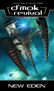
Here’s the final version of the cover:
There’s so many fine details about this station and the surrounding area of space. For instance, the gleam off the dome, the trail of ships going into the arms, the windows on the station… I think it’s amazing and beautiful.
In the end, I believe I accomplished all my main goals for this with exception to a changing of the guard. However, one could argue that so much obvious Nukari technology shows something is up at New Eden… Exactly what I want people (that are familiar with the series) to wonder about.
So, that’s the story about book 4’s cover development!

