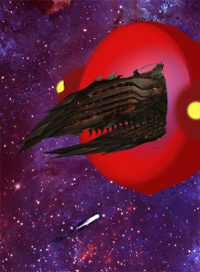
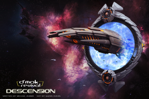
The pressure was on. The Awakening had a fantastic cover. I loved the nebula and the arachnid-like space station. Then came the incredible visualization of the asteroid base for Retribution’s cover. After two amazing starts, I fretted about how to keep the trend going–even topping the previous ones!
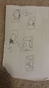
I scrawled down the image on a scrap of envelope paper. Now, for those that have not read the third book yet, this is NOT a spoiler for the following reasons: 1) their armada has been threatening since the first book, 2) the back cover tells you the armada comes out swinging, 3) the prolog at the beginning of the book talks about the armada and a gateway being built. I won’t provide any spoilers or additional information about the scene than what I just mentioned.
Now, beyond the general descriptions of Nukari ships, no rendered versions of their vessels existed! If I wanted to display them, we needed a design. Then there was the gate. There were aspects mentioned in the book, but nothing out-rightly specific about the visuals. It’s always fun to provide enough information to let the reader visualize their version in their mind. But, if I wanted that on the cover too, it would also need to be visually concepted.
So began the design for Nukari ships. I wanted them to be aggressive, dangerous looking, and capable. They needed to look like they could take a pounding, and deal great damage. I made a quick list of the things that instilled fear people, as its the effect the Nukari would want their ships to have on opponents. I looked to our “lizard brains” for stimuli there… There’s 6 questions your lizard brain asks of every pieces of stimulus throughout the day: 1) can I eat it, 2) can it eat me, 3) can I kill it, 4) can it kill me, 5) can I have sex with it, 6) can it have sex with me (perhaps unwanted).
A few obvious criteria jump out: can it kill me, can I kill it, can it eat me. Then I went to nature, what types of nature’s gifts create natural offenses/defenses for animals? Skin texture, natural body covering (scales, shells), body coloring, claws, teeth, a solid body structure, muscular composition, body size, and distance based defenses. I then performed an animal image search on Google looking for various creatures.
After searching various creatures with tusks (boars and mammoths), horns (rhinos), and sleekness (black panther), I came across the Pangolin.
http://media.tumblr.com/tumblr_mcpl92H8Bj1rxphab.jpg
Beautiful creature. It doesn’t look very deadly, but it looks well defended with its sturdy body scales.
This was the upgraded vision…
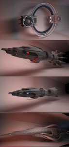
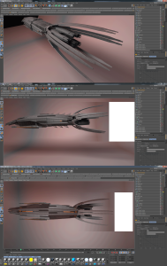
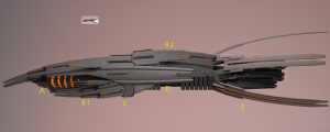
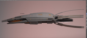
I sent the concepts off to my amazing 3D designer, Glenn Clovis, who began to render a number of options. Some were more industrial, some more organic… Here are two of the many versions he did. I’m showing these because they’re both officially a part of the D’mok Revival universe and protected assets (thanks to copyrights). Yes, the ship on the bottom will be used–I’m not tell where, when, or how yet… But I do know.)
I really loved the slick, smooth, almost squid like version (at the bottom). But it didn’t “feel Nukari” to me. The overlapping armor layers of the top ones were like the Pangolin, and felt great. I knew this was the right direction.
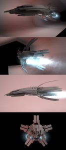
He reworked the design based on some feedback.
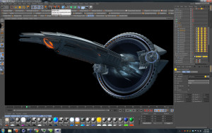
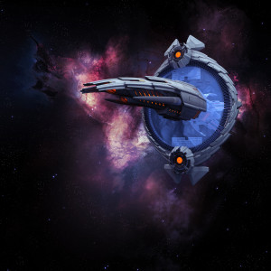
There, now that we had the ship, we could go after the gateway. I wanted the designs to look related since the Nukari made both the ship and gate technologies. After a few revisions, the overlapping armor was applied to the design.
And BOOM! It’s one of those things where you see it and go, “THIS IS IT!” I was blown away. I was thrilled! We’d done it again. I love collaborating with Glenn. He’s a visionary, so very talented, and easy to work with (and patient with me).
I hope you enjoy it as much as I do!

![tumblr_mcpl92H8Bj1rxphab[1]](http://dmokrevival.com/wp/wp-content/uploads/2014/12/tumblr_mcpl92H8Bj1rxphab1-300x160.jpg)
