From original manuscript to 3 books

I’ve been asked how the original 286,000 word manuscript compared to the final 286,000 word Nukari Invasion Trilogy.  The truth is: it evolved a great deal!  Entire segments were removed or reconstructed, characters were added, new storylines injected, and timelines on various events shifted. This is due, in part, to an amazing editor (Arlene Robinson), reviews from family and friends, and my own growth as a writer.

Keep in mind, before D’mok Revival was a novel it was originally intended to be a role playing game. Hundreds of pages of backstory and a gameplay system created the foundation for a future computer/console RPG.

The original manuscript was my virtual play through of the original 24 source modules. Sure, the order seemed to make great sense at the time, but it could have happened very differently, after all, that’s what a game designer intends when creating modules for an expansive universe.  You want the game players to create their version of it through their decisions, etc.


For those concerned about spoilers, the next sections are clearly labeled with specific books and the changes made to them.  Read only as far as you’d like to!
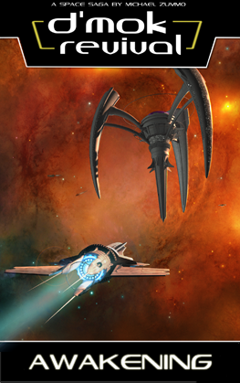
 

book1_coverart

Book 1: Awakening

The first book was the closest to the original manuscript. My editor at the time helped with some grammatical aspects and some restructuring.  Note: it wasn’t Arlene Robinson for this book—long story why not. I corrected that mistake moving forward. He also said Rhysus had far too much power from the outset, always came up with a new ability to get himself out of a situation, and never seemed like he was honestly in danger–ever.

Now, anyone who’s watched Japanese Anime and sentai shows (Sailormoon, Dragonball Z, etc.) knows this is EXACTLY how characters develop and new abilities emerge.  Great burst of emotion, near defeat, with a win from a new power.  Nevertheless, the books were targeted at a North American audience, and toning things down didn’t seem so bad.  So how and when Rhysus’ abilities emerged was restructured.  He’s much less powerful and far less in control from start to finish.

His other major suggestion was to have Toriko’s “professor arc” resolve in book one. He said “something needs to be resolved in your first book.” And so, the professor, who was saved originally in book three, DIES in book one.  How’s that for a change?

Those were the main things the first editor contributed.  On to more changes that I imposed!

Originally there was no prolog. As I neared the end of writing the massive manuscript, I felt it needed more of an opener. I thought of this in terms of the opening CG of a video game. I wanted something that got the readers up-to-speed on the story and helped expose the mindset of Rhysus. In the end, I really loved the dark and disturbed result.

The first chapter, which introduced Osuto and Rhysus’ abilities remained mostly intact. My original editor suggested I cut everything from the prolog through Rhysus’ arrival at the Trading Post.  He was concerned the first part was too slow and would lose people. I kept it in because I wanted to provide more context for who Rhysus was and what he was doing and not just drop people into the Trading Post.

The initial experience on the trading post remained the same.

My editor originally suggested removing the introduction of Menla on Aeun. He said she was a red herring and didn’t have a purpose.  She does show up in the epilog of book 2, and comes back in book 4.  I, of course, had an idea of her future use and wanted to keep her introduction in so readers could go back and go “Oh my gosh, she’s right there–on Aeun–the WHOLE TIME!” 😉

The section with picking up Toriko was radically overhauled. The original concept had Daleron diverting Rhysus’ teleport to the underground versions and interrogating him, accusing him of kidnapping Toriko (who had gone missing).  It turns out she went into hiding herself and left cyber-caches that, after all were recovered, would lead to her. It provided more background about her legendary status on their version of the Internet as Master Tecra (alluded to in book 2), and her reputation for cyber-caching, a phenomena where they use the internet to find coordinates of cool things, then hunt down the caches at those coordinates. It’s actually based on GEO-Caching, a real thing in the USA. The parts found in the caches were assembled into a robot that led Daleron and Rhysus to her.  They trekked through more of the underground to bring down the teleportation system. There was also a communications grid that could phase in and out (don’t ask) they needed to destroy before invading the Nukari base found in the lower versions of the Murai Dome.

This whole thing was reworked to start with Toriko already in the company of Daleron. Spark also led Rhysus through the lower versions to her.  Don’t worry, a future book about Toriko will bring back more exploration of the lower versions of the Murai Dome on Tericn!

Toriko’s physical stature changed a bit.  The original editor said he didn’t envision her as more overweight (as she was listed), so I had Ujaku make a comment about her weight loss.  She’s not, and never will be, skinny. I want her to be a healthy weight, if not slightly over-weight.

Nothing changed when Toriko and Rhysus saved Ujaku from the mercenaries, nor when they went to the graveyard of ships. The chapters that cover the initial flight of their ship and crash remained the same.

The section that captured Rhysus’ chase of Allia through her caverns was shortened, but otherwise remained largely unchanged. The segment where Rhysus goes to Abunai and finds Naijen was the same.

When Allia falls sick with radiation poisoning, Eyani originally said the medical facilities were not up and going on the Trading Post yet, so she sends him to an ally of hers off-station. This relic store owner sends the team (minus Allia) on a mission to a dessert world to capture a creature that can siphon the radiation out of her (crazy right)?

This evolved into Eyani being able to help them directly with medical facilities, which you’d expect a massive station to have available. Instead, she asks a favor (the first of two). They do go to the desert world, but for a totally different reason. The adventure in the sand ruins was shortened, and refocused on the statue. The rest of that was in the original manuscript.

Crystal legacies remained the same.  But the final mission to the sister science station was embellished. I brought back the professor, who had led the Nukari to that station, and created a backstory for him to explain how and why that was possible. To my surprise, the professor was killed when the Nukari attempted to escape. Rhysus’ awakening with respect to his responsibilities and abilities also pop here.

The other major change was Bob’s role. Originally he was just comic relief.  As people read the original manuscript people LOVED him. Seriously, LOVED him. Given Bob was in every system an idea sprung to mind: what if Bob was much more than he seemed? He transformed in my mind from a helper system to a powerful AI that ran the station and much of Eden too.  He became a main character moving forward.

Another interesting dynamic was the human fallibility Rhysus displayed with how he handled the death of the professor.  This would come back to haunt him.
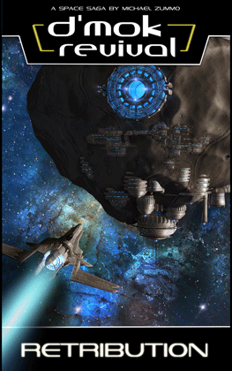
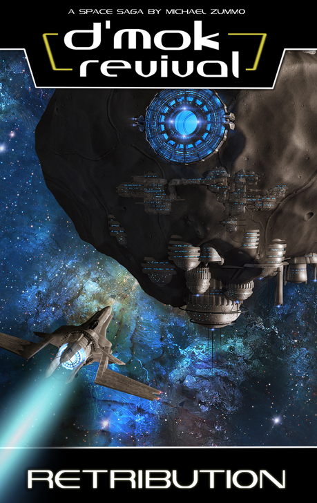
 

book2_coverart

Book 2: Retribution

I learned so much from book one’s release. There were insightful reviews, direct emails, Facebook messages, and more that helped me understand where the first book was strong, and where improvement could be found.  I’m thankful for the feedback!

One of the big issues from book one was: Where were the Nukari, exactly? Some criticized it was too “adventur-ie” and the main bad guys “just ran a company on one of the planets.” The original intention was the main character didn’t know much about what was going on, nor where the Nukari were, you the reader shouldn’t know either. That didn’t seem to work. In the end, people were looking for more action, more direct conflict with the Nukari, etc.

Believe it or not, the Nukari Beasts (or Combinates as they were originally called) were mentioned towards the end of book 2 defending a Dyson Sphere. It was this same chapter where Anrik’s group was first introduced.  When I began reworking book 2, I saw this as an immediate opportunity to build upon.

The prolog was actually a chapter that appeared earlier in book 2 that was intended to tease what was to come with Katen. With a few tweaks I infused information about the Nukari Beasts, Anrik’s team, and ultimately Mencari’s team into it. Suddenly it became a great primer for all the players the reader would encounter in book 2. Boom!  It was segmented out and placed as the prolog.

At that point I created the entire thread about the Nukari Beasts.  I had a short story I wrote to understand dynamics in my universe where Rhysus ran into Decreta (who was more human looking back then) in a bar. Soon both were called away, then found themselves meeting in combat in space directly after (yet somehow they didn’t recognize each other—don’t ask).  I liked the meet-in-a-bar concept, and saw a change to use it on the first world where the Nukari Beasts attacked.  However, I used it to introduce Anrik instead. Funny how things change-up.

The resolution to Toriko’s professor’s death was also added. It gave me a chance to really give a spine to Toriko. Everything that happens to her concerning the death of the professor, including getting the new outfit and ship from Maro, was added in the rewrite. Personally, I think it added amazing depth to Toriko (and Maro).

The chapters with Nikko, Cogeni, and his mother were in the original manuscript. Nikko was far more passive in her first incarnation. She also hid the fact she had abilities from Cogeni. I think she was so weak because, of all the characters, I didn’t understand who she was at the time. By the time I starting re-editing book 2, she became far clearer to me.  After all, I had already written the fourth manuscript where (never mind—no spoilers)…  Just believe me, I clearly understood her now.  So, I evolved her in book 2. She was more confident, capable, an equal. This was a great change!

The various leads, and exploration of Luon was all in the original manuscript. I created more interesting descriptions of the characters and main locations. I had to rewrite the problem Zuri had with Allia to make it more plausible, in addition to Allia pushing herself to manifest her abilities. Otherwise, the essence of those chapters stayed the same—including Seigie’s “cure.”

Turf War was the reworking of what used to be about the Nukari beasts defense of a Nukari controlled Dyson Sphere (think Star Trek The Next Generation here). In the new version, Eden was tracking the beasts and led Rhysus’ team to them. With this I wrote an entirely new battle scene, really digging into the specifics of each character’s experience.

The next section covered finding Cerna. This originally came much later in book 3. However, adding Cerna now added an interesting element to book 2. Here the group ran back into the relic store owner from the first book.  He was an ancient “Dark Lord” from Cerna’s world. Seeing I took him out of the first book, he needed to get pulled from the second. I also changed the group landing on an asteroid and finding a shrine with information, to more of a gateway shrine. I also made the shield around the Cosmic Temple activate to force the characters inside. The experience inside the template was vastly shortened. The original version had them exploring more inside the temple finding traps left by Dark Lords, messages from Cerna’s faction, etc. It will be useful for a future video game version, but not for a succinct, focused reading experience.

I also embellished the memory crystal records inside the temple, and the technology that kept her alive.  Originally Cerna was in a leaf-like tomb, which had to be cut into to find her. The descriptions around this tomb were sparse, and honestly not inspired.  So, I reworked the entire thing.

There was also a side quest to find her glaive after freeing her. Also, before going back to the asteroid base she had Rhysus take her down to her world to see the aftermath. There was even a segment where she reanimated a prisoner to free him. Again, unnecessary. Cut.

The mission to attack the “big Nukari ship” remained mostly the same from the original. There were more Nomads involved, which were simplified down to one core representative in the final story. There were so many characters in my books. I learned to really only name ones that mattered.

Once Katen was a part of the group, the final showdown with the Nukari Beasts could take place. Foul 359 was an entire new piece, and the big crescendo for book 2.  As you may have read, I worked in many references, homages, puns, etc. from popular science fiction and video games into the story.  Foul 359 is an anagram for Wolf 359 from Star Trek The Next Generation…  It’s where the Borg with Locutus (Picard turned Borg) attacked the Federation.  I thought it would be fun to play with in my story.

A few things happened in this new ending that helped the future books. Mainly, Anrik had been captured. The Nukari would now have lots of information about the Human Coalition. Katen saved the day, which helped show his allegiance. Decreta was also captured, which is how the original Dyson Sphere version went down.

In the end, the rewrite also had Mencari finally accepting his wife and son’s demise and taking off the ring he so tightly clung to up to this point.

The other notable aspect that changed in book 2’s rewrite was Mini-T. Before she was a helper system, much like the original concept for Bob. Instead, she rapidly evolved into an advanced AI. This continues through the series. Wait until you see what happens in book 4…  But I digress.

On, one final addition… The boy with the green eyes!  Now, he plays a big role after book 4… So I wanted to introduce the concept of him here. See, it’s a good thing I didn’t release all these books yet. I had the chance to evolve things and make it seem like it was always planned this way.  😉

The epilog was originally a part of the final chapter. It just worked better isolated since it was from the perspective of the Nukari and not Rhysus or his group.


book3-cover-small-notab

Book 3: Descension

The prolog was brand new. It was so much fun to write!  I LOVED envisioning Kajlit’ga.  She’s such a beast, and yet, I found she had redeeming qualities.  I didn’t intend that, but that’s what I saw and thought, so that’s what I typed.  It gave her depth, which was fantastic.

The pocket work concept was in the original manuscript.  However the entire set of chapters came much earlier in book 2. It now led book 3.  This was interesting as it introduced another unique power to the D’mok literary universe (and possibly future video game). 😉

I added more descriptions of the moon, and create a color caste system for the Aloan defenders and High Dome Guards. Those encountered with ability stifling powers, and mindseers was all new. I thought it added a lot of color to Aloan society, and really helped show how a world of super-beings would be run.

I cleaned up the interactions in the museum, specifically with accessing the ancient D’mar section. I went into more detail about Jeyla, Siana, and Raitr (as they show back up in book 4, and I understood them better now). I also tweaked D’gorra’s presence, and the final experience on the moon leading to D’gorra’s power grab. The rest stayed the same.

The Nukari trap that springs on Ruul really evolved nicely. The world of Ruul became a space junk wasteland, and with it a whole new set of dynamics and scenery. I love how it transformed!  As such, I worked on making the trek through Ruul appropriate given the new terrain and threats.

As Rhysus was searching for Toriko’s group, I changed how they found one another.  Originally Naijen did a massive attack that ripped up through the ground, and Rhysus and company flew down. It was far too convenient.  I took the idea of Naijen creating massive attacks, and rewrote the scenario so something he did still led to the catastrophe going on across Ruul.  But I redid how Rhysus found Toriko’s group. In the new version the Nukari were also more of a threat.

The original version also had Rhysus with a mental break, which was far too cliché for me now. One of his over-powered attacks led to a near collapse of the tunnels, leading to a combination of Seigie and Speru’s abilities to keep the roof from collapsing. The new version is better.

Moonbase Alpha covered the interrogation of the captured Nukari commander and the Nukari beast from the end of book 2. Specifically, Katen used his abilities to Mindwalk the beast. This was in the original manuscript, but was removed from the third book. My editor, Arlene, said it just interrupted the flow of things.  I totally agreed, but wanted to make sure people could still experience the mindwalk. That’s why I created a self-contained short story of the removed mindwalk section.

The rest of the moonbase alpha and K’pec chapters remained the same.

The mission where Kiyanna took the group to Keros had some tightening, but remained the same for the most part.

Beast Hollow was refined to be more plausible given the characters, their knowledge, and skills of the group at that point. Decreta’s space travel ability was back up and usable, Bob and Mini-T were able to hack systems in the new version, and I wanted to show off more of the Nukari genetic experiments and beasts.  I also involved the Nomad fleet in helping to destroy the Nukari space station. In the end, I think it was more action packed than the original.  Osuto’s overuse of his abilities was also in the original manuscript.

I punched up the drama for Paradise Lost (playing off of Milton’s story talking about “Eden”). You also get to find out who the boy with the green eyes is.  Again, none of this history existed in the story until the rewrite. I even came to understand myself more about Eisah’s mother.

Legends never die dramatically changed.  For starters, in the revised version Kiyanna had a major role in designing the attack on the Nukari. She really shined!  What she planned, and how she executed it was not in the original script.  I LOVED the rewrite!

In the original version Cerna unleashes Sabereth around her homeworld. Why she did this it didn’t say. I theorized she did it so if the Nukari or other unwelcomed people came back to her nebula they wouldn’t get the power of the Cosmic Temple. Regardless, in the rewrite she does not free the cosmic entity. However, this opens the door for what’s going to happen in a future book.  Again, can’t mention more about that yet!  Sorry!

The attack on the Nukari Command, now called the Nukari Colonial Authority, was very different. The original version had three specific missions presented in the book. They took place at the same time, so the reader experienced one at a time, but saw references to help understand the timeline. While interesting, and GREAT for a video game experience (think the end of Final Fantasy 6), the book version needed one clear thread to follow.  So, I simplified it down to one view of the battle.

The big scene with the Leviathan remained the same from the original manuscript.  I was always proud of that particular scene.  It will be awesome in a future movie… Haha.

I reworked Dane’s character to be a bit less obtuse with the situation too.

In the end, I added a small part with Eisah in the dream sequence. The rest of that chapter remained the same, including the cliff hanger surprise! I was very proud of the way the original manuscript ended and kept it!

I wrote a new epilog from Kajlit’ga’s perspective. You saw her final rise to power, and what the Nukari were doing in the aftermath of the allied attack on them. The reader will know the story is far from over.


And there you have it!  How the original manuscript evolved into the current Nukari Invasion Trilogy!

D’mok Revival: Descension’s cover design

The pressure was on. The Awakening had a fantastic cover. I loved the nebula and the arachnid-like space station. Then came the incredible visualization of the asteroid base for Retribution’s cover. After two amazing starts, I fretted about how to keep the trend going–even topping the previous ones!

What to put on the third cover? It had to be visually striking, invoke an emotion. I thought about the core story of the third book, and the tension slowly building over the course of the trilogy. Inspiration struck! It was obvious. I had to show the Nukari armada.  I smiled as a vision appeared in my mind.
20141219_075600

I scrawled down the image on a scrap of envelope paper.  Now, for those that have not read the third book yet, this is NOT a spoiler for the following reasons: 1) their armada has been threatening since the first book, 2) the back cover tells you the armada comes out swinging, 3) the prolog at the beginning of the book talks about the armada and a gateway being built.  I won’t provide any spoilers or additional information about the scene than what I just mentioned.

Now, beyond the general descriptions of Nukari ships, no rendered versions of their vessels existed!  If I wanted to display them, we needed a design. Then there was the gate. There were aspects mentioned in the book, but nothing out-rightly specific about the visuals. It’s always fun to provide enough information to let the reader visualize their version in their mind. But, if I wanted that on the cover too, it would also need to be visually concepted.

So began the design for Nukari ships. I wanted them to be aggressive, dangerous looking, and capable. They needed to look like they could take a pounding, and deal great damage.  I made a quick list of the things that instilled fear people, as its the effect the Nukari would want their ships to have on opponents.  I looked to our “lizard brains” for stimuli there…  There’s 6 questions your lizard brain asks of every pieces of stimulus throughout the day: 1) can I eat it, 2) can it eat me, 3) can I kill it, 4) can it kill me, 5) can I have sex with it, 6) can it have sex with me (perhaps unwanted).

A few obvious criteria jump out: can it kill me, can I kill it, can it eat me.  Then I went to nature, what types of nature’s gifts create natural offenses/defenses for animals? Skin texture, natural body covering (scales, shells), body coloring, claws, teeth, a solid body structure, muscular composition, body size, and distance based defenses.  I then performed an animal image search on Google looking for various creatures.

After searching various creatures with tusks (boars and mammoths), horns (rhinos), and sleekness (black panther), I came across the Pangolin.

tumblr_mcpl92H8Bj1rxphab[1]

http://media.tumblr.com/tumblr_mcpl92H8Bj1rxphab.jpg

Beautiful creature.  It doesn’t look very deadly, but it looks well defended with its sturdy body scales.

This was the upgraded vision…

cover-3-first-concept

I sent the concepts off to my amazing 3D designer, Glenn Clovis, who began to render a number of options.  Some were more industrial, some more organic… Here are two of the many versions he did.  I’m showing these because they’re both officially a part of the D’mok Revival universe and protected assets (thanks to copyrights).  Yes, the ship on the bottom will be used–I’m not tell where, when, or how yet… But I do know.)

Dmok3_StagateAndConcepts

I really loved the slick, smooth, almost squid like version (at the bottom).  But it didn’t “feel Nukari” to me.  The overlapping armor layers of the top ones were like the Pangolin, and felt great.  I knew this was the right direction.

He reworked the design based on some feedback.

Dmok3_CapitalShip_N
SO COOL!  Though the initial ship seemed too small.  Perhaps it would make a great fighter, but not the big “Laviathan” ship mentioned. I provided some feedback, and the next evolution appeared. He also started to apply the overlapping armor layers to the gate.
gate render
I liked where this was going. It still looked too vulnerable in the middle. I also wanted the front to look like “a deadly face.”  So we swapped the front cannons with longer, tusk-like components.  I also suggested we continue the layers of body armor to the rear of the ship.
revised-for-glenn
I made some suggestions like the following…
ship-size-contrast
Glenn took that and iterated.  To simply the design, we dropped the side cannons, and added a larger front cannon (inspired by the Bird of Prey from Star Trek).  After review, I thought it was cool, but had him add a second smaller one directly under it (it would have its uses).  We ended up with the following design:
final-annotations

There, now that we had the ship, we could go after the gateway.  I wanted the designs to look related since the Nukari made both the ship and gate technologies.  After a few revisions, the overlapping armor was applied to the design.

Now we had to combine them.  We investigated a few angles (head-on, from the side, from an angle, etc.).  I wanted a dramatic scene.  My very first vision had an extremely closer perspective looking up at a sharp angle. We ended up being a little further back since the up-close view looked a bit distorted.  I wanted people to see the amazing detail of the ship, gate, and future nebula.
Glenn assembled the complete picture.
dmok3
The nebula was instantly striking (he’s so good). There was some lighting tweaks, and some changing of the effect within the gate. In the end, to provide scale, I thought we could go back to the “fighter” design and add some in.  It would make it look like an armada coming through the gate (Which was the point), and help explain the big ship was — BIG.
book-3-wallpaper

And BOOM!  It’s one of those things where you see it and go, “THIS IS IT!”  I was blown away.  I was thrilled!  We’d done it again. I love collaborating with Glenn.  He’s a visionary, so very talented, and easy to work with (and patient with me).

I hope you enjoy it as much as I do!

Planning for the third book launch for January

It’s time for another launch party! To kick things off I made one of my famous lists:

What is D’mok Revival: Mindwalk?

During the editing process of book three, my amazing editor, Arlene Robinson, voiced her concern about two specific chapters. It wasn’t that she didn’t like them, she felt they interrupted the pacing and focus of the overall story arc.

The two chapters in question were around 13,000 words that covered the mindwalk that the character known as Katen does in the mind of the Nukari beast captured in book two.

The segment exposed a great deal of information about what’s going on in the Nukari side of the universe.  Specifically, where the contemporary Nukari beasts were created, what type of master Kajlit’ga was, how the Nukari beast felt about Nukari activities, and what they knew about Rhysus Mencari.

It was very difficult to pull it from book three because I felt it really provided great insights into what’s happening in the D’mok literary universe.  It also exposed the mysterious personalities of Fio’tro and Fia’ra, and proved they were more than a bad case of dementia for Katen. In fact, you see their abilities and finally understand that Katen’s powers are actually a result of channeling what all three beings once individually did.

My editor did, in fact, review the content and professionally edit it. In response to some of her concerns and confusions, I added more content taking the word count to over 15,000.  In the end, she really enjoyed it and saw the value in what it added to the D’mok literary universe.

I couldn’t sit on this! I wanted to share it, especially for the amazing fans of the D’mok series.  So, I decided to package it up and release it as a stand-alone short story.  In late December, D’mok Revival: Mindwalk will go public.  To help with getting the word out, I’m going to provide in from two sources: Amazon for a minimal cost and, for fans, a special link to the D’mok Revival site where existing fans can get it for FREE. 😉

I’m looking forward to getting feedback on what people think about Mindwalk.

Book 3 is nearly here!

Two weeks after I launched D’mok Revival: Retribution I sent the completed third manuscript to my amazing editor Arlene. I knew in order to achieve my December 2014 release I needed to get the manuscript edited, and a new cover design from Glenn by October, so I could print it in November, and have it by my goal.

I promised my fans, so I worked hard!  I’m proud (thrilled) to announce book 3, D’mok Revival: Descension, is on schedule.  In fact, today I’ve updated the dmokrevival.com site to reflect the artwork of the third book.  If you go into the “Extras” section you can download your very over desktop artwork featuring the new cover artwork.

I have to say, working with Glenn has again been a dream. We’re a great team, and I think people will love the new cover. Arlene has pushed hard to keep the final book of the Nukari Invasion Trilogy concise and streamlined.  As a result, I have two entire chapters (over 10,000 words) that have been removed from the main book.

Fear not!  I will release this very important segment as a Web exclusive right here on dmokrevival.com.

I’ve also updated the branding for book 1.  I’m so excited to get the third book in your hands and get your thoughts and feedback!

If you’ve been following the Facebook D’mok Revival page, you’ll also see a hint of another big announcement concerning the D’mok Revival universe coming up. But I won’t tell you now, you have to wait until the launch event for book 3!

As always, thank you for your amazing support!  Please keep the feedback coming!


New Amazon Options for Authors

I’m a strong supporter of Amazon’s offerings including personal stores (where I sell my physical copies of D’mok Revival), Audible/ACX.com (where I have my audio book), and the Kindle Direct Publishing (KDP.amazon.com) for my ebooks.

The KDP program, in particular, is fantastic.  It’s easy to use, has powerful reports concerning sales, and offers great marketing programs for those releasing their products exclusively through Amazon.  Personally, I believe it’s worth that requirement! 🙂

There’s a new offering coming from Amazon that I just learned about this morning.  I wanted to share it in the event others would be interested too!  It sounds like an great program.  I’m not sure if I’ll take advantage of it yet.

——————————————————————————————————–

Email From Amazon on Sept. 26, 2014

Dear Author,
Here at Amazon, we are working on a new program that will help you kick-start your book and potentially earn a new publishing contract – in 45 days or less.
Books will be published through a soon-to-be launched Amazon program. In the meantime here’s how it will work:

  1. Authors will be asked to submit their complete, never-before-published book and cover.
  2. After a few days, we will post the first pages of each book on a new website for readers to preview and nominate their favorites.
  3. Books with the most nominations will be  reviewed by our team for potential publication.

Should you be selected for publication you will receive benefits that include:

  • Guaranteed advance & competitive royalties: You will receive a guaranteed $1,500 advance and 50% eBook royalty rate.
  • Focused formats: We acquire worldwide publication rights for eBook and audio formats in all languages. You retain all other rights, including print.
  • 5-year renewable terms, $5,000 in royalties: If your book doesn’t earn $5,000 in royalties during your initial 5-year contract term, and any 5-year renewal term after that, you can choose to stop publishing with us.
  • Easy reversions: After two years, your rights in any format or language that remains unpublished, or all rights for any book that earns less than $500 in total royalties in the preceding 12-month period, can be reverted upon request – no questions asked.
  • Early downloads & reviews: One week prior to release date, everyone who nominated your book will receive a free, early copy to help build momentum and customer reviews.
  • Featured Amazon marketing: Your book will be enrolled into the Kindle Owners’ Lending Library, Kindle Unlimited as well as be eligible for targeted email campaigns and promotions.

We believe authors thrive with options. If you value an advance, creative control, competitive royalties and marketing opportunities – this new program might be perfect for you.


Creating your book cover

The cover is the first place you can capture a reader’s imagination and make them want to see more about “that.” You have mere seconds as people scan across thumbnails online, or across a book shelf to snag their attention. People ALWAYS judge a book by its cover first. In fact, the brain is optimized to discern appealing things in an instant.

Getting the contents of a book is very important. However, if the cover isn’t epic, if it doesn’t snag people’s attention, getting people to read your content will be a far more difficult task.

I thought I’d go through and talk about the process used for the second cover.

  1. Build on knowledge of the genre, researched the first time around
  2. Leverage what I’ve learned from book 1’s cover
  3. Build the series identity
  4. Tapping action of book 2
  5. Initial concepts
  6. Focus group testing and iteration


BUILD ON KNOWLEDGE

When I first entered the science fiction space (pun intended), I researched the major series. I was interested in aligning my visuals and branding with space operas and household science fiction names. Specifics included: Star Wars, Star Trek, Firefly, Babylon 5, Dune, Battlestar Galactica, Stargate, and so on.

I analyzed logo design and placement, common elements on covers, where they put series versus book names, how they designed their book spine, how much information they put on the cover, etc.

There were clear patterns. A bold series logo was at the top, with book name directly under it, or on the bottom of the cover. Stories with well known characters used illustrations against a space backdrop. Others focused on the technology showing ships or space stations. More imaginative ones also tried to illustrate a specific moment in the book. Back covers were sparce, with some text, little visuals. Spines typically displayed a tiny visual, mostly logos and book names.

As a side note, I also reviewed fantasy covers. Those are typically beautiful and very visually engaging. Even the spines have amazing artwork.


LEVERAGE

The first cover had a show-stopper scene with an intense background, ominous space station, ship heading towards it. People were instantly drawn to it. Hundreds of people at ComicCon Chicago didn’t know anything about my series, but they saw the visual and came over to find out. This showed me how important the main visual was to get right! The other aspect I learned was to keep cover elements simple and focused. Don’t over clutter the main visual. Allow a few, larger elements to strike hard and pull them in. Most of all, drive their curiosity. Make them want to “visit” that place (by reading your story).

After launch, I was frequently told how understated my series name was on the first cover. Also, while the book title at the bottom was well sized, it wasn’t chaining with the series name as I had hoped. Another weakness was the lack of review quotes and other things to legitimize the work, or give people context for how others interpret the story.

I have a number of awards I could put on the cover: Amazon top 20 best seller in Alien Invasion, and 5-star winner by Readers’ Choice. But those came after the launch. Admittedly this is a tough one for me, as professional reviewers still won’t touch the series.

Nevertheless, you may have professional reviewers. If you do, try to fit in a few key words or phrases from their review on your cover. Just look at the top 40 book shelf to see how the pros position quotes.


BUILDING SERIES

I’m working on creating a particular look for the series. A cool background, a major location, and a main ship is the approach I’m going to use for covers of the first trilogy. I’m also going to use a color scheme approach. The first book’s nebula was red, this one will be blue. Depending on the feel of the third book it may be more violet.

I want to create a consistency with the visual appearance. This means the logo will be at the top, there will be a black barred off area on the bottom for the book title. The spine will have the “wrap-around” space scene at the top and bottom, with the logo and book title in the middle. The back will have a barred off top and bottom showing the “wrap-around” space scene with Nukari and D’mar logos in the corner. The descriptive text will be on black. It creates a specific, streamlined look that I really like.

I have, as of the second book, updated the logo based on the feedback I received. It’s cleaner and larger. I’m going back and modifying the first book to support this update to the branding.


TAPPING ACTION

As I mentioned before I want to visually engage readers, and pique their interest. The first book shows the Trading Post, a major location throughout the series. The second will focus on Osuto’s asteroid base. As another major location for the series, I wanted to show people what it looks like in addition to wanting them to “go inside” and experience what it’s like to be there.

For now, the same ship from the first cover is being shown again. It was assumed to be either Osuto’s ship or the one recovered from the graveyard of ships in the first book. Technically, it could also be Ujaku’s ship. Which ship it is has not been finally decided yet. Strange right? Let’s just say, for now, I’ve left it up to the reader to determine which it is. I’m guessing most people assume it’s Osuto’s ship.

Glenn did an amazing design that shows more of the asteroids around it, and a sweeping nebula.
INITIAL CONCEPT

When Glenn and I started working on the second cover, the first thing I did was a crude wireframe design showing the desired blocking for visual elements.
original_sketch
See how crude this was? I only wanted to get the idea across to Glenn. He’s the one that works the magic. I also sent along images of similar concepts of asteroid bases from Google images. Surprisingly, there were few examples of asteroid bases, much less ones that aligned with what I wanted. Many had an element or two, but nothing like what I wanted.

As a side note, it’s important when designing a cover to leverage the visual “Z” scan westerners do with their eyes when reading. They start in the upper-left, move right to the far edge, diagonally down left to the lower left corner, the right again to the lower-right corner. These are basic usability concepts that I leverage in software and Web site design all the time. This is also the pattern used in the first book, and it performed well.

For the second cover, I placed the asteroid base in the same position as the space station, and the ship in the same location.

Glenn went ahead and did an initial version of the asteroid base.

first_mock-up
AMAZING START! I had some feedback about additional build-out for the station, and creating more of a connection between the massive space dock and the lower base segment. Then he added in the nebula and some effects.

first_nebula

The nebula was very cool, but didn’t have the radiant blue aspects I had in my head. The base and ship was also cast into shadow, and lost the great detail there. I know printed images tend to go darker than they appear digitally, so I was concerned the image would literally get lost when it went to the press.
first_blue_nebula

This version really made things pop. But the eye was really drawn directly down the left side of the image. In fact, the eye rested on the ship, and the viewer actually missed the station buildings at the bottom of the asteroid. Lighting is so important! I thought adding some building lights would also bring the lower section of the station to life too.

second_blue_nebula
The lights were a cool addition. The ship was angled to look like it was headed to the dock. To me the ship got lost because in all the amazing detail of the nebula. Among the changes I suggested included changing the source of the light so it illuminated more of the right size of the asteroid.

changed_light1
The difference was striking! Glenn enhanced the lighting to bring some features out, and boom, done!

final_lighting


FOCUS GROUP

Each stage of design I tapped my “review team” as I call them. This is a combination of my email group of fans and friends, and then the D’mok Revival Facebook page. Getting my readership’s reactions is very important to me! I was able to quickly get a read on how design performed, identify what people thought was weak about it, etc. Patterns in responses were clear. Those that care about your series also love contributing, so ask them!

Side note: don’t forget to thank those amazing people in your book too!

You can’t be afraid to iterate. You can’t be afraid to talk to your audience. Remember, you get one shot at releasing a book. Make sure when it hits, it hits the mark. Reviewers and readers will not be kind when you launch a product, so help yourself now and get feedback before there’s a train wreck.

In addition to amazing fans, I have a number of friends who are both science fiction fans, and fans of honesty. They let me know exactly when something didn’t resonate with them. At one of our board game nights I showed them the latest cover. They suggested, while the nebula was cool, to really zoom in on the asteroid base. The concept was to make it more intense, spotlight the amazing visuals. I thought the idea was great. I made a number of zoomed in versions and took to Facebook. The community instantly responded and sent me their thoughts. Again, clear patterns emerged.

The cover you see today is a result of vision, amazing artistry, and key feedback from the D’mok community.

final-cover-design

Okay, you may notice the contrail is more pronounced. The truth is I LOVED the contrail from the first book.  I actually lifted it from the Photoshop file and superimposed it on this one.  I also added a little shadowing effect to both highlight it and create more of a wake disturbance behind the spaceship.  It also draws the eye to the left corner, supporting the “Z” visual scan for the viewer’s eyes.


FUTURE

Right now I’m beginning the process on book 3. Taking my own advice above, I’ve started early sketches. Even though the launch party for book 2 is July 19th (next month), I promised to get book 3 out by the holiday season. I need to keep the momentum going and move on it. Once book 2 is out, I’ll start getting cover feedback from the community on the third edition.

Finding a new printer for my softcover edition of book 2

Have my first book printed by Mira Publishing was very informative. I had no idea what I was doing.  Fortunately I had an angel, Brittney Braur, as the internal PM to Mira that made sure everything went flawlessly.  She quickly, but carefully, explained the various options available to me for a digital press run and made recommendations about things like paper stock that increased the quality. Knowing I was paying for it all on my own she also pointed out things that I could do that would reduce costs for the project. In the end, her influence produced a superior result that I was very happy with.

Then came the second, offset, print run. This meant a different printing process was being used to handle my larger volume of 2000 copies. Brittney was no longer with Mira, and it had been bought by another company. There were numerous disconnects that led to a print that, while still good, wasn’t as good as the first print in my own opinion. For instance, the stark white paper isn’t what I requested. In fact, when I got my printed proof I specifically called out that wasn’t the right paper.  They said it was just a test for the proof.  It turned out that WAS the paper they used in the end.  Another oddity, there’s BLANK PAGES at the end of the book.  No one mentioned that going to an offset printer (versus a digital press like my smaller first print) would mean I’d have to work in print palettes, groupings of 12 or 16 pages.  I could have EASILY adjusted margins or font size to soak up the extra pages.  Instead it looks like I have a bunch of errors at the end of every book. The cover, while it has a great gloss on it, lacked the color depth seen in the original print.  The red nebula looks much muddier, even brownish. It’s still a GREAT visual, but it was an AWESOME visual to begin with.  Regardless the book was still a great product, sells well, and has not had a single complaint or return.

When I began pre-printing planning for book two I returned to what I new. However, this time Mira’s bid on the project was significantly higher.  In fact, they said I had gotten quite a deal the first time through. I just couldn’t justify the additional cost.  At this stage of the game I didn’t need 2000 copies of book 2, just enough for initial launch, publicity copies, and a small stock to sell on Amazon.  Once demand existed I’d print more.

This led me on a search for additional options. I consulted with Brittney Braur, who now has her own promotion company (which I HIGHLY RECOMMEND). She and I had talked about a company called Lightning Source that actually handed all the self-published printing from Amazon and other large companies.  They’re kind of the Roundy’s of the printing industry.  Everyone slaps their own label on, but it goes through them.

I made a mistake and typed in Lightning press. Turns out they really do exist http://www.lightning-press.com/.  I’d forgotten the second name in the printer (“source”), so I thought I found what Brittney and I had talked about.  They had a very easy online quote tool, and their sales process was responsive and helpful. My sales contact, Paul, was easy to work with, and answered my questions quickly.

I placed the order, was able to follow-up with payment on the phone the next morning (which I preferred).  Paul and I even talked about the project, and some of my concerns.  I also got clarification about the use of #100 cover (I had selected), and discovered a 12pt cover would be a more solid stock to use, especially since I didn’t need printing on both sides of the cover.  He spelled out the dimensions for the Word manuscript document, and the Photoshop cover. Because I adjusted the margins, used single spacing between rows, and reduced the font size I was able to reduce the overall page count (page count can dramatically impact printing costs), the spine size had to change. I had to adjust the Photoshop file I used from cover one to accommodate. I was nervous about getting all the dimensions exactly right.

I updated the files, and submitted them via their Web site. I received the digital proofs the next day. I also found an error in my manuscript that they changed without additional charges. I also noticed the cover was a few pixels off.  Yes, I wanted to fix that. I made the change, re-uploaded it, saw the new digital proof, and hit approve.  I got the physical proof (that I ordered with the printing package) in a few days.  It looked great.  No changes to make.  I approved it online as well.

The 120 printed books came in 4 boxes the next week. They were packed and protected well, and the books looked AMAZING.  The cover looks exactly like the digital image (lots of detail, bright blues, etc.). The content looked exactly as it was supposed to.  I’m VERY happy with Lightning Press. I do plan on using them again and highly recommend them.

I’m still interested in Lighting Source, and plan to try them out for the short-order of book 3. It’s important to have a few options. But I KNOW I will be using Lightning Press again too.

Your audio book is LIVE!

This is part 3 to the audio book creation posting.

Part 1: Creating The Audio Book On Audible.com
Part 2: After Signing your audio book talent
Part 3: Your Audio Book is Live

—————————————————————————————————————

Once the voice talent has the initial recordings “in the can,” then they work with their own producer to assemble the final cut and perform their own QA process.

After Kyle and his producer wrapped up their part, they posted it to the ACX.com site for my review.

I then began the process of reviewing all 11 hours and 45 minutes of final audio.

In a perfect world I’d be sitting in front of a computer, the original script in view while listening to the recording.

Initially I was curious what it sounded like, wanting to hear it “organically” without following along with the voice-in-my-head that would be reading my manuscript while listening to Kyle.  I found that I remembered, word-for-word, the manuscript without having to see it in Microsoft Word.

I actually found it better to listen to it without my script. Believe you me, after working so long on a book, you’re going to remember what you wrote.

I easily caught a few mispronunciations, some extra long pauses, even three words that were missed from the beginning of a character’s statement. I documented out the chapter, what the issue was, and the words around it so he could find it easily.  In hindsight, I could have added a time index as well for them.

I actually wondered how things would be handled when an important name was mispronounced, and worried it would be a good deal of rework.  It’s one of those things where you want your fans to hear the words as they were intended, while also not wanting to burden your voice talent.  However, I am paying for the audio book’s production, and I do want it to be the best quality and most representative of my work as it can be.

One thing was crystal clear: Kyle was the right choice!  He did an amazing job. I loved the way he voiced the many characters, and really brought the story to life.

I sent my notes off to Kyle.  He was professional and easy to talk with about the issues I found.  In a matter of days they were fixed–even the mispronunciations (where one alone had 18 instances across multiple chapters).

I then worked on the cover.  The Audible.com format requires a cover that’s 2400×2400 pixels. That’s very different from my soft cover size. So I needed to rework it a bit.  I did an initial design, uploaded it to ACX, and hit approve.  I made the assumption it would be easy to change like it is in “Seller Central” on Amazon.com.

Once I approved the book it then brokered the payment for services.  It actually let’s you pay outside ACX.  I ended up using PayPal. You hit a button that says you paid, the provider clicks a button that says you paid, and it’s done.

Next the book moves into an approval cycle with ACX itself.  They review the book for quality before putting it live. That’s great!  I totally understand why. Their email said it could take up to about 14-20 days. My day 1 was Feb. 27th.

I wanted to tweak the cover design before going live. I did a few iterations, had my fans on Facebook provide some feedback, and locked in a final cover.  The problem was, there’s no way to update your book once you hit approve.  NONE.  I sent a message to ACX and they said I could send them the new cover and they’d manually update it. WHAT? That seems really strange, but okay.  I sent the update off to them.

On March 4th (6 days after the review started by ACX) I received an email from ACX that D’mok Revival: Awakening was approved and release live for sale.

WAIT!  For how much?  What was the product copy being shown with it?  Was the new cover there?

I had no idea!  So I logged in.  I went to the “Completed Projects” tab as instructed by the same “you’re on sale” email.  All it showed was how many books were sold (zero).  There’s no clear way to get at price, or channel.  Remember they also sell on iTunes and Amazon.  So confusing!

I replied to the email from acx.com asking how to set the price, and when the new cover would be posted.

I went to audible.com and searched for my book.  Surprise!  It was out there.  The cost set by audible was $24.95. Not sure where that came from or if I can adjust it.  Then I noticed the “Publishers” copy and the mini-promotion by the cover.  They simply took the text I used to attract voice talent and plopped it out there!  I was shocked and horrified.  I never intended the public-at-large to see that?!  Nothing I read said that’s what would be taken.

Knowing ACX didn’t have a real editing system for published books (since you had to send them image updates for your book and have them do it), my assumption is I’d have to go to them to change the publisher copy too.

Wow.  It’s not the end of the world, but come on!  I knew something seemed wrong when I couldn’t find any information or posts about what happened outside of the production process.

We’ll see how fast ACX.com can get back to me and how quickly I can correct things.  GREAT lessons learned!  🙂

Overall, I still love the ACX process. Next time I know what to watch out for right out of the gate.

Multitasking

There are so many incredible things going on right now!

I just finished my review of Kyle McCarley’s audio production of D’mok Revival: Awakening. I think he did a superb job. His creative take on the characters really brought them to life, and took the printed word to an entirely new level.  There are certainly a number of lessons learned from this experience, which I’ll post another blog entry about soon.

It’s time to start ramping up the promotion machine to prepare for the launch of the audio book.  I’m guessing late March for the début!

Then there’s book number 2: D’mok Revival: Retribution!  I’m working with Arlene Robinson again, my original editor that took on the 286,000 word manuscript (which became the Nukari Invasion Trilogy).  So much has evolved since I initially worked with her that I wanted her special touch in polishing the new incarnation of the second manuscript.

I’m very proud of how the second manuscript has transformed. At first I was apply the changes to the universe based on edits to the first book. Then I began to apply everything that I learned from the release of Awakening, and took into consideration reviews and fan interests.  I ended up reworking a great deal of the manuscript and wrote around 150 pages of new content. Some things were pulled back from book 3, others pushed forward, all in the name of creating a solid book two arc in addition to the invasion story progression. She’s currently doing her editing pass, and will have that complete mid-March.

For those that have been following D’mok Revival on Facebook, they know that I’ve been working with Glenn Clovis for the cover design of book 2.  Posting out to Facebook has allowed me to gather instant fan feedback and help cultivate the final look.  I should have the print-ready cover in a week or so.

The back-cover copy has also been vetted on Facebook a few times.  In essence, the soft cover and ebook marketing components are in great shape and nearly ready for prime-time!

I also have an initial marketing strategy prepared including solicitations of reviews and advertising to promote book 2.

As much as this seems, when my son goes to sleep I find myself still with more bandwidth. I’ve actually started working in book 3 already!  My goal is to have it out by holiday 2014 (yes, this year)—winter 2015 at the latest.  I really want it out this year yet.

I am so excited to continue this streak of amazing progress. It’s wonderful to have amazing fans who share HONEST feedback (not just the stuff they like), which helps me evolve as a writer and bring more to the D’mok Universe.