It’s hard to believe, but my book series is now 13 years old with seven released works! Though it’s been a while since I’ve released a new book, I have two new ones coming out yet this year. With the new editions comes a branding update. I wanted to share with you the journey and how things evolved over time.
Zummo Books, LLC
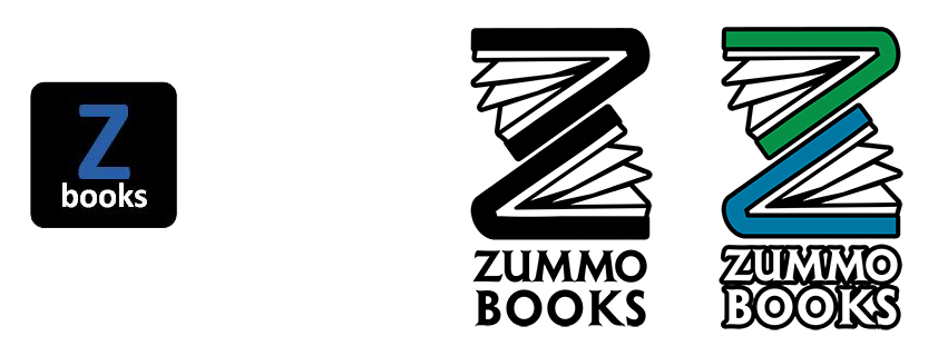
This is my “parent company” responsible for all production, publishing, manufacturing, advertising, and distribution. To be honest the original left-ide version started as a very basic legal entity. I wasn’t thinking about brand. Even the name wasn’t very inspired (but very functional).
My original logo played off what my friend Tara began calling me (“Z”). while I wasn’t very focused on the look and feel, the simple letter and books label got things started.
As we approached the two new books in 2025 Matt redesigned the logo. Using two books he reconstructed the “Z.” I really like his font update for “Zummo Books.”
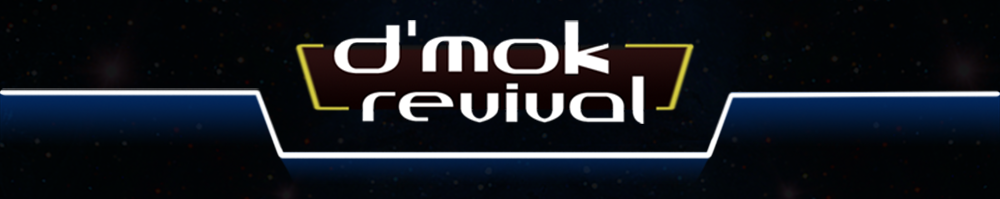
D’mok Revival
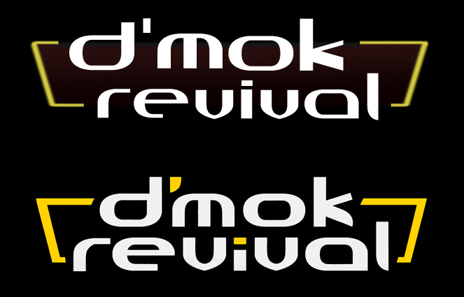
This was my debut series! I spent a ton of time on the cover and crafting something intense, interesting, and feeling very space opera-ey… I wanted the wordmark to feel very classic ala Dune, Star Wars, Star Trek, etc. I heavily modified a futuristic font and added the golden bars on either side. The top version lasted in all books, media materials, and the Web site until September 2025!
Matt’s updated design (lower version) is coming out this month. It feels more robust and modernized but still retains the original overall style. It’s interesting how just the shape of an apostrophe can make all the difference too, but it does!
D’mok Revival Emblem
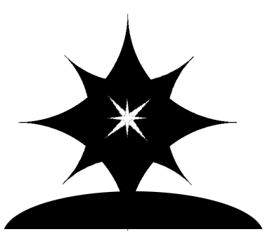
It wasn’t until Weun Academy that emblems came into the picture. Before that it was all wordmarks! Sometime around 2016 Matt made the first emblem… Years later I would craft one for D’mok Revival… Intending to look like a Northstar beaming brightly on the horizon (or Rhysus up in the atmosphere blazing in light)… Matt still needs to do an updated version of this. Seeing I don’t fully need this until D’mok Revival book 5 comes out (likely a few years), he has time.
D’mok Universe
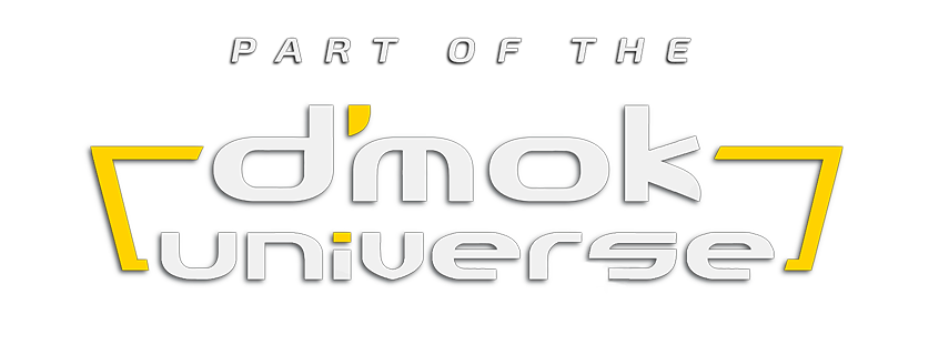
We needed a concept to put on the back covers of my first two spin-off series from D’mok Revival. It had to show it was in the same literary universe without confusing people that it was an edition of the D’mok Revival series! In the end, Matt and I feel it holds true to the original while clearly spelling out what the labeled book is offering: a piece of the D’mok Revival expanded literary universe.
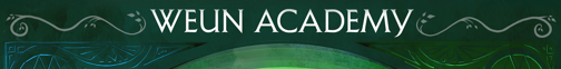
Weun Academy
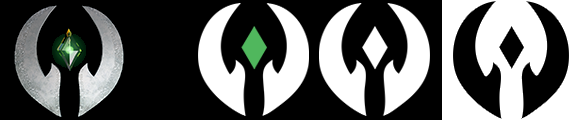
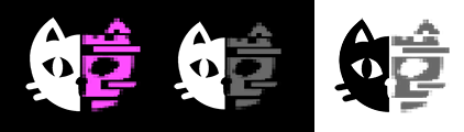
My first spin-off series!! Originally the hands of Segie Weun (originally spelling) with her famous green crystal floating in the air, the Weun Academy Symbol intended would become the emblem worn on all students and faculty (and double as a communicator / AI assistant source). There was a etched stone motif for the outer hands and a 3d rendered crystal as pictured on the left. The updated version, which will appear on the cover and within the Weun Academy book content is now flattened with versions provided for use based on color vs B&W, and background.
It’s simple, elegant, and I love it.
Weun Academy Wordmark
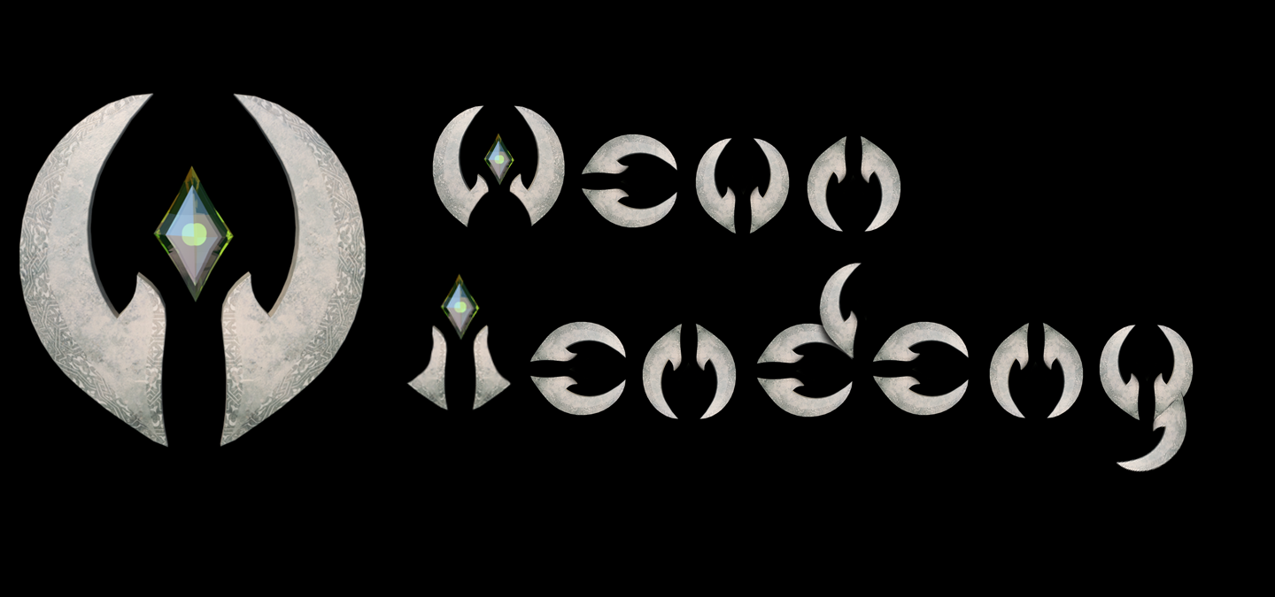
While we had an emblem, we still developed a wordmark. As you can see we “attempted” to look like a real university(-ish). We also attempted to play off the D’mok Revival wordmark. They were all pretty rough (to be nice).
The above version is taken directly off the cover. We have a more “academic looking” font with some flourishes. The emblem is on the spine and inside the book content.
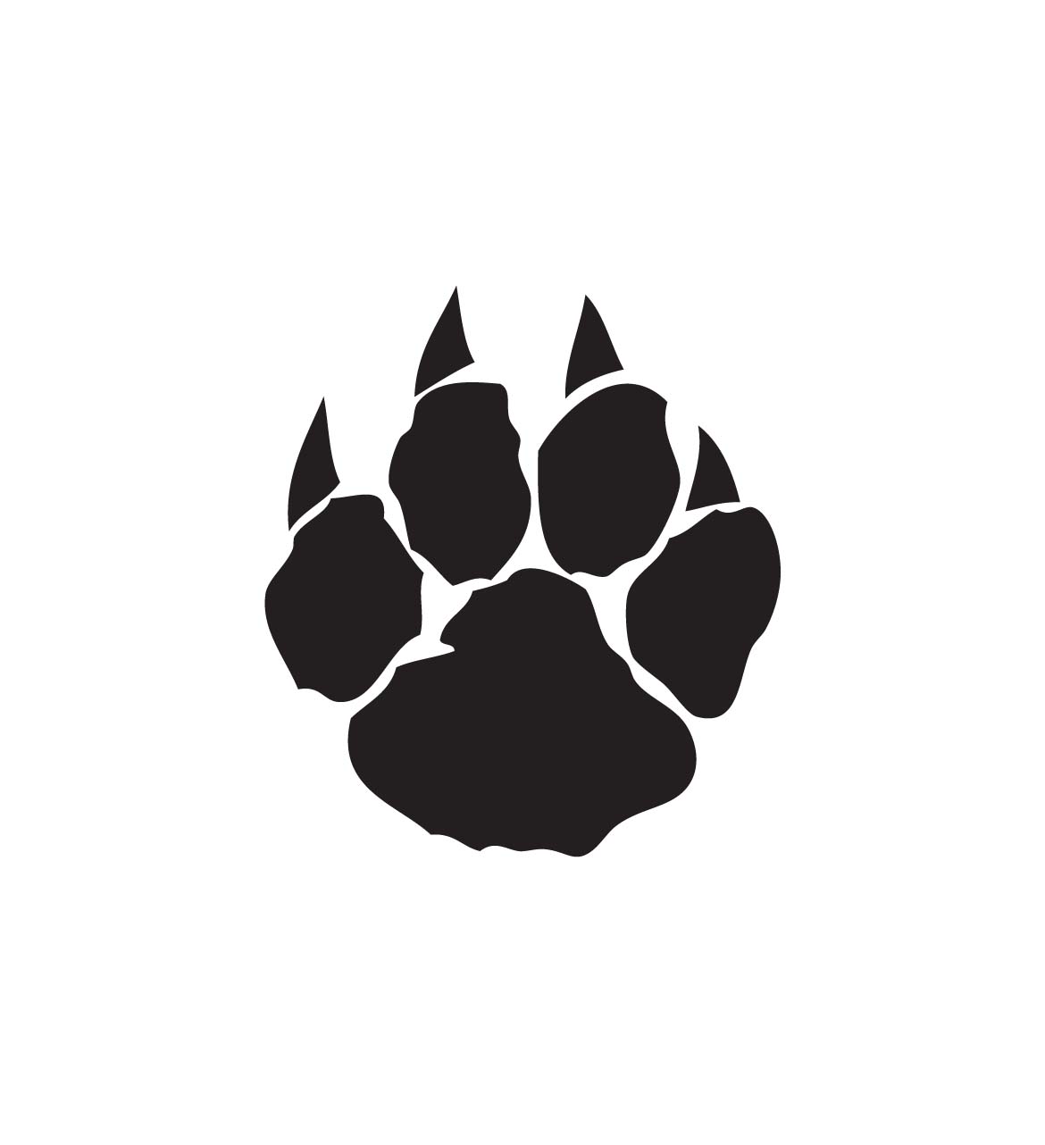
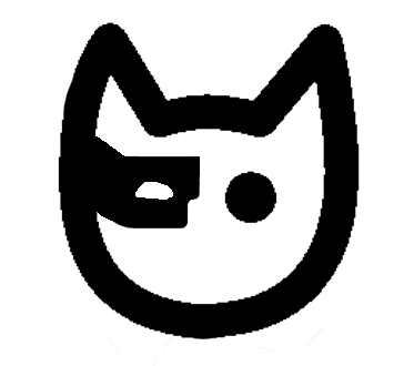
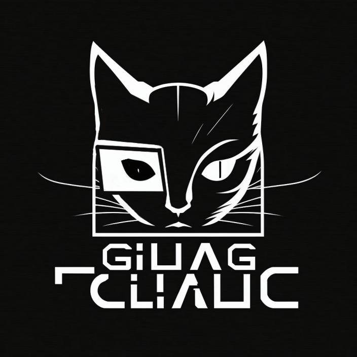
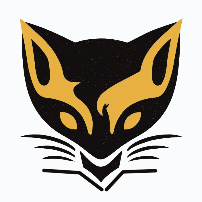
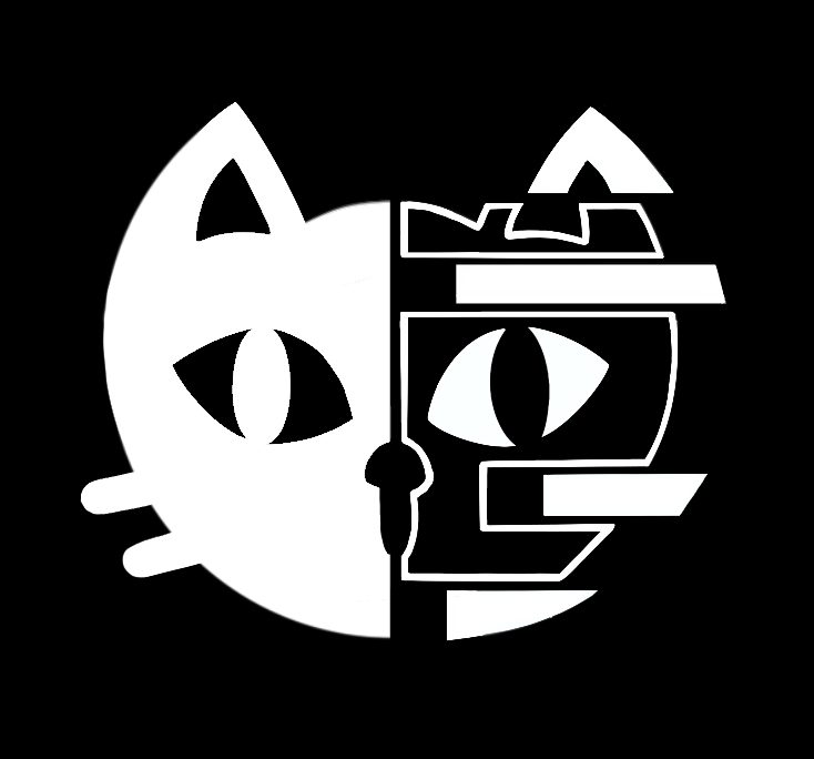
Toriko Tales
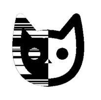
My second spin-off series! The very first placeholder emblem started as Toriko’s outline, then a cat’s paw, and finally transformed to a kitty head with a Dragonball Z eye glass device.

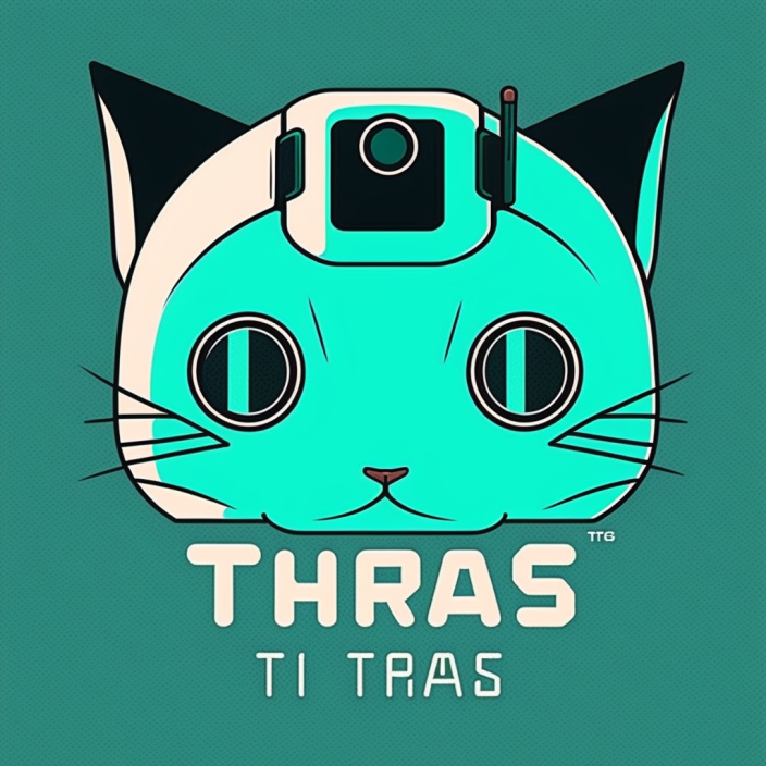
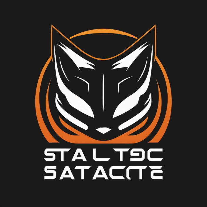
Once we started working on “real emblems” Midjourney came into the picture. As a springboard for ideas (not final renders) a range of cat/robot/cinematic emblems were generated.
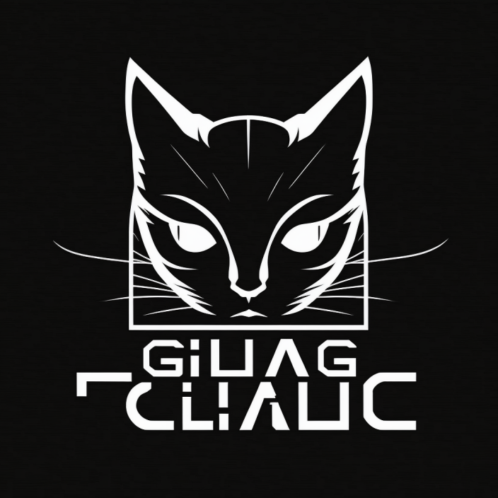
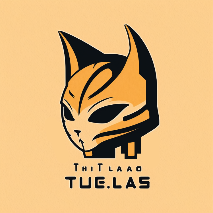
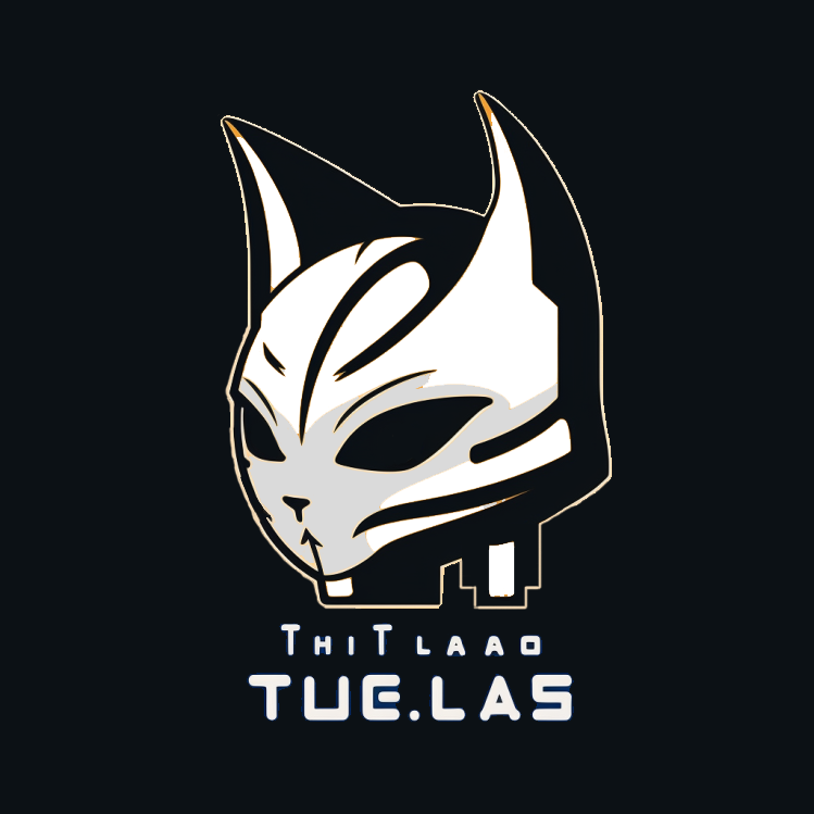
Then came the updated “let’s represent the virtual and real worlds including robotics/AI” approach.
A rough version based off my original placeholder led the approach followed by a collaboration with Matt.
Finally we landed on the versions above that Matt and I both really love. It even creates some unease with the viewer when looking at the “digital side.”
Evolution over time and the future
What a ride! I’m so proud of how far branding has come–and impressed with Matt’s amazing skills and contributions! I’m very thankful to have such a creative and invested partner in something so fundamental to my life!!
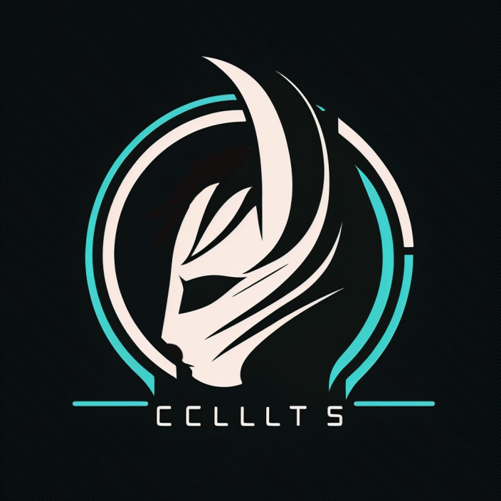
Can’t wait to see where the third spin-off series, Wayfinder, goes. If you want a little preview… He’s an emblem I did years ago (yes, I’ve known about this spin-off for a long time). Clearly Matt did not work on this. But it’s what I have for now. 😀

Amazing visuals are required to make even the best story get noticed. I’m very thankful for all the time, effort, and creativity Matt continues to put into the D’mok universe.
And that’s all for today!